
How to Paint a Lion in Acrylics
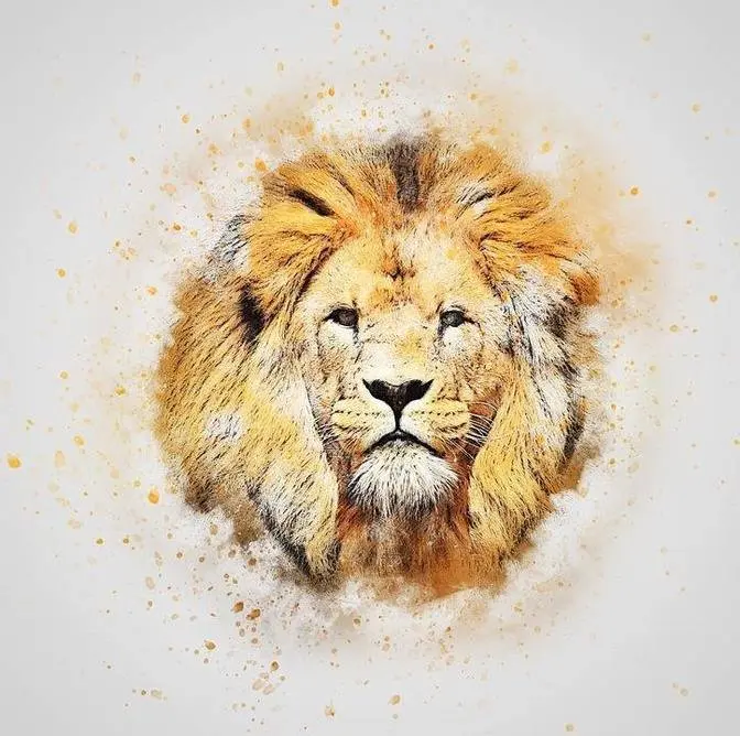
4 Video Views·Dec 5, 2024
Hey everyone, Cassie Draws here and welcome to today's video.
Today I'm going to be teaching you how to paint a basic lion portrait with acrylics.
A quick note before we get started, a big shout out to our channel sponsors
Chartpak, Grumbacher and Molotow for sponsoring today's video.
Thank you so much for your support and without further ado,
let's grab your paints and go ahead and get started.
So the first step in today's tutorial is to go ahead and get your preliminary sketch
down on your canvas.
So I have chosen to use the grid method for this painting
and 98% of my paintings that I do, I use the grid method.
It is something that I'm comfortable with.
I love to work with the grid method and it really allows for a nice,
strong foundation for my paintings.
I will cover a video on this later in 2022,
but for now you can see that I've completed the sketch off screen.
Now also here is a reference that I'm working from for today's painting.
It is a beautiful front facing well lit photograph
and most of my references come from wildlife references for artists.
However, there are some free alternatives like Pixabay
and Unsplash that I encourage you to check out as well
that have great options for references.
So whether you're following along with me today,
I will have this reference periodically put up on the screen for you
or if you were using this video as a tips and tricks video
and you're going to paint your own lion head,
by all means, grab that reference, get your sketch completed
and now we can go ahead and start putting down some base layers.
The first step in our painting together
is to outline the eyes, the nose and the mouth area.
And the reason why I choose to do this first
is so that no matter how messy my painting may get
with these base layers and kind of changing back and forth colors
and adding shadow and light,
no matter how messy my painting will get,
these areas will always manage to shine through
and be able to be seen.
There have been a lot of times where I've been painting a subject
and when I did not do this,
I've lost track of that foundation, that anatomy,
that sketch that we worked really hard to get down onto our canvas
somehow just manages to disappear.
And so my solution to this was to start by outlining
the darkest areas on my portrait
and that's the eyes, the nostrils, the mouth
and then the tip of the ears on this lion portrait as well.
So the next step in our painting,
once you have those key areas defined,
we can go ahead now and start working on the shadows
of our portrait as well.
So keep in mind, this is just our first base layer.
So I'm watering down my paint basically to a wash
and I'm just studying my reference
to see where all of these dark shadows are.
So you can see in the center there,
I'm adding quite a big stripe
or a lot of volume, if you will, of a shadow.
The sides of the cheek,
where the cheekbone is kind of sunken in
and then throughout the mane as well,
this lion has a beautifully gorgeous colored mane
that has a lot of different colors.
So I'm not getting caught up in details at this point.
I am just looking at your lighting and your shadow.
It does not have to be perfect.
You can see here that my painting looks a little messy.
It looks a little rough right now
and that is exactly what we're looking for.
Organic, sort of fun, natural, really keeping it light.
We have many more layers to go.
So really just study your reference,
focus on where those shadowed elements are
and slowly start to get those blocked in.
Now the bottom of this painting,
I am doing a lot more opaque
and the reason being is because this area of the lion
is a very dark, dark mane
with not a lot of detail in it or layering really.
So I knew that I could fill this in
with a full opaque sort of brown color
and not have to worry about fussing with layers later on.
It was pretty much one or two colors.
All right, so once your base shadow layers have dried,
we can go ahead now and start working
on the mid-tone section of this painting.
Now when I'm choosing a mid-tone color,
I'm basically looking at my reference
and choosing a color that is right in the middle
between my light and my dark values.
So you don't wanna go too dark,
but you don't wanna go too light
unless of course you have a really,
really dramatically lit portrait.
Then we're talking about a completely different ball game.
But for this one,
because it is a very nice well-lit photograph
across the board,
the photo is really nice and crisp,
detailed and in great lighting.
I chose something that's right in the middle
that I can add some darker values to
or lighter values to down the road
when I start to work on the second, third and fourth layers.
So just keep that in mind.
You don't wanna work too dark,
but you don't wanna also go too light as well.
And for the face area,
I have used more of a wash
and you will see a comparison
between the main and the face as well
in terms of the opaqueness.
And the reason why I'm going
a little bit more opaque with the main
is because I want the main to be really nicely blended
and have a lot of cool, nice color shifts.
You can see that I'm adding multiple colors to this mixture
to kind of create some really nice variations.
And with the face,
I want it to be a little bit more conservative.
I wanted that anatomy still to shine through.
I know you can't really see it that well
on this kind of camera angle,
but I can still see my sketch at this point.
Whereas with the main,
I wanted it to be a little bit more,
not abstract,
but if it went a little bit awry with it
or a little bit strained from the reference,
I was comfortable that I could be able
to bring that back to the reference
and kind of fix any areas
that needed to be adjusted really
by the end of the portrait.
So I'm having much more fun with the main
and a little bit more conservative on the face,
but please feel free,
use whatever brushes you prefer for this section
and kind of just really have fun with it.
So the next step,
once our shadows and our mid-tones are completed,
we can go ahead now
and start filling in the background.
And the reason why I'm doing the background now
is so that once I start working
on those further main details,
working on some more layering
and the more highlighted areas,
we don't have to worry about trying
to fuss with the background.
We're working from the back to the front.
So I'm just roughly haphazardly
drawing this in with my paint,
and then I'll go ahead and refine it
even further later on in the painting.
The next step in our painting together
is to work on getting the eyes completed.
And the reason why I like to complete the eyes
as soon as possible
is because they are the window to the soul.
It doesn't matter whether it is a pet
or a wild animal or even a human portrait,
most viewers of artwork
will connect with the eyes right away.
That is the area
that they are gravitated to the most.
So I like to set the tone
for the rest of my painting.
And I find that if I really nail
the way that the eyes look
compared to the reference,
the rest of the reference
kind of just falls into place
and you really manage to capture that realism.
So what I'd like you to do
is I'd like you to start looking at your reference
and work from back to front.
So we're going to drop in
all of those shadow layers.
We're going to work on
getting a lot of that texture in
as well with those shadows.
So if you Google eyes up close,
you can actually see them
where they're in like a macro lens
or a microscope, if you will,
really, really close up irises.
You can see that they have
a lot of texture in them.
So they have almost like
these spider-like qualities,
almost like a spiderweb.
I call them veins.
It's definitely not scientific at all,
but they have these little veins
and sort of markings throughout.
And one thing that I find
really amps up my realism in my portrait
is including that in the eyes.
So you can see around the left
and the right hand side of my eyes
that I have these kind of
brown little markings there
that I'm trying to illustrate
as best as possible.
So keep that in mind
as you're working through your eyes
and just really focus
on layering, layering, layering.
I completed these eyes
in six to seven layers
of different colors
of oranges and browns
and adding that catch light
on the top as well as my final layer
really brings them together.
So just keep that in mind.
I'm ranting about eyes,
but I think it's so important.
And so just keep that in mind
when you're painting yours.
Layer, layer, layer,
and really focus on
what colors are present
and switching up that color value
every so often
to make it much more realistic.
This next part in the painting,
I get a lot of comments
and questions asking about fur
and how I go about painting it
and how to make it
a little bit easier
because it is, in my opinion,
aside from the eyes,
the most complex part
of this painting.
So how I like to go
about creating fur
is I basically,
once my base layers are dry,
I go ahead and I take a darker color
than the base layer
and I slowly start to block
in the direction
that the hair is moving
the direction of it.
I am not worrying about
every single strand of hair.
I used to do this a lot
with my wildlife art
and it's something that
I'm still trying to break.
It's a habit that I'm
still trying to work on.
And so with this painting,
I was really focused on
only getting the movement
and the direction of the hair.
So much like a human,
we have our hair
that grows on our head
in a certain direction
from like the crown of your head.
There's like a whole
scientific part of it,
but it grows in a certain way,
just like we have curly
or straight hair.
Lions do as well
or big cats in general.
Anything with fur
has a direction
that it grows on the face.
So I'm looking at the area
of the cheek
and the top of the eyebrow.
It's moving up
towards the top of the mane
or the cheek is moving out
to the left and to the bottom.
So how that fur moves,
I am just tracking
with this darker color.
Once I have my darker color
the way that I want,
you can see that
I'm slowly starting to add
in a mid tone on top
and a little bit of a highlight.
I am not worrying about
those top final layers
at this point.
I've got a lot more work
to do on this portrait,
so I'm not focused on that.
But my biggest piece of advice
with any kind of big cat
painting or wildlife
painting in general
is try not to get caught up
in just painting
individual hairs.
Work on finding the clumps first.
So is there a chunk of hair
as you can see here
under that eye?
There's kind of a chunk
of hair there
that dips into a shadow,
but the top parts of it
are much more light
and much more highlighted
under that eye.
So I'm focusing on the chunks
that I see,
not necessarily
individual fine hairs.
We can go and do that
afterwards and to taste.
We don't want our entire
portrait to be pin sharp.
If you look at photography
in general,
there are a lot of areas
or even other paintings,
other artists
that you may be inspired by.
There are areas
of their paintings
or photography
that is out of focus.
Maybe the subject has moved.
Maybe it is jumping in motion.
So the bottom part,
the legs and the tail
are out of focus,
but the front part
with the face is in focus.
So keep that in mind
as you are painting.
I'm trying to really make
the eyes and the nose area
pin sharp, very focused,
very highly detailed.
But as I move out
towards the side of the face here,
you can see that the chunks
of hair are getting wider.
I am not being as precise.
I'm kind of a little bit
more messy with it
and blending this out
with either a blender brush
or doing some glazes after,
which we're going to talk
further in the video
about really glazing
that out is super important
and really helps create
a nice faded effect,
which sometimes can be
very tough to find
and to nail with acrylics.
Acrylic can be very contrast.
So really trying to blend
that out can be difficult.
And we're going to talk about
that a little bit
later on in the video.
This next step in our painting
together is to start working
on some more shadow details.
So I'm going to start
adding in this darker wash
to the left hand side
of the canvas.
So the main area,
the inside of the ear,
the top of the forehead
and the canvas right as well.
So those have some
really dark elements.
And I wanted to make sure
I got those in first
before I started working
on any other details
on the face.
I'm going to take
this exact same value now
and I'm going to add in
the whisker holes on the face.
So I'm not drawing perfect circles.
I'm just kind of blocking
in their general shapes.
You can see I've added those in
and I'm also going to take
this color and put it across
the bridge of the nose as well.
And based on my reference,
I know that the bridge of the nose
has a much darker tone to it.
So I can just go ahead
and fill this all in
and then worry about
doing the fur details later on.
Next for this portrait,
we're going to go ahead
and work on the nose
and get that completed now.
So what you're going to do
is you're going to take
a darker color than our
original base color that we used.
And you're just going to go in
and start blocking in
where these shadowed elements are.
Now I am using two to three layers
of different shadow colors.
I'm not jumping into
the darkest value first.
I'm kind of slowly,
gradually building up the shadow
so that it makes it
a little bit more realistic.
And it's not quite contrast
of just pink and black,
if you will.
There's some grays
and some brown tones as well.
So I'm just slowly starting
to step up this shadow.
And I'm also using what I call
a nice little stippling technique
to get those really beautiful
age spots or freckles
on my lion nose as well.
So I'm lightly touching the canvas
with a really small brush
and just kind of
illustrating those details.
And you can see already
that it has made quite a difference
and looks really quite realistic.
The next step in our painting
is to start working
on the fur details
on the bridge of the nose
and then slowly working down
towards the mouth area.
And what I'm doing is
I'm just taking
a really small brush here
and I'm just working
in the direction of the fur.
Now it's important
to keep in mind as well,
with these areas
across the bridge of the nose
in and around the eyes,
lions do have these
really short, spiky hairs.
And so it's really important
to let the brush
do the work for you.
Just lightly tapping the canvas
with this paint,
dragging just a touch.
The more you drag,
the longer the hair is.
So I'm just basically
lightly touching this canvas
and you can see that
it gets a really cool
kind of spiky, short haired effect.
It's also very important
to keep in mind, too,
that sometimes less is more.
And I used to do this
a lot with my paintings
is I would get so excited
at this stage in the painting.
You can see it come to life.
You see your lion
there in front of you.
You're proud of it.
You're having a blast.
You're enjoying yourself.
And then we realize,
oh, my gosh, I did
way too many layers here.
All of that information
underneath has disappeared.
So it's very important
to remember less is more.
Keep some of that
information underneath,
like that big kind of
you can see there
on the bridge of the nose.
There's this really big
stripe of brown there
that is a fold of skin.
So this lion has
a lot of skin on its nose.
And so that is a wrinkle
that I want to keep there
and not cover
with this short, spiky hair.
Now, again, I like to work
in many different areas.
So while this nose is drying,
I'm just going to jump
over to the right.
But basically,
and I always feel bad
saying this, a lot of these
paintings are rinse and repeat.
Once you get a handle
of these techniques
and these sort of
methods of painting,
it really is just doing
the same thing
around the entire canvas.
So I'm taking this
dark shadow color.
And while the nose is drying,
I'm working on the muzzle area.
And you could also see
that I added in some details
on the right hand side
with a light wash as well.
So to taste, go around
the right hand side
of your canvas and really
just block in that information.
And you can see that
I'm just doing again
those short, spiky
hairs on the muzzle.
And it's really starting
to come together.
Now, glazing is something
very important that I wanted
to talk about in today's video.
It is something very new to me
that I actually hadn't done
in my artwork prior to this piece.
So this is something new
and I'm excited to share.
Glazing is essentially
using a liquefied
or watered down acrylic
paint in any color
and covering over white paint
to create a new color
on your canvas.
So you can see at one time
our bridge of our nose was white
or it was a very, very light
kind of like ivory color.
And now by taking a watered
down brown color,
I'm just going over top
with my brush and really
covering over it
to create a new color.
So rather than worrying
about having to mix
all of these individual colors
and to get them right,
we can use glazing to go over top
and actually change its properties.
So you can see that
the bridge of the nose
now is much, much more muted.
It is not as bright,
not as contrast
as when that white paint was there.
It's just kind of beautiful
sort of silky brown color.
So you'll see throughout
when I bring out
my big filbert brush
and I'm just lightly
passing over the canvas,
I am doing some washes
and I will do them
on the muzzle as well
to kind of tone down
some of these tones.
So glazing I'll cover
a few times.
Very, very important.
And just keep that in mind
if you ever need to make a color
or your lion is not orange enough
or your lion is not
a yellow enough
or golden hour color,
you can always add that in over top
and to change what you've actually
put down on your canvas.
So what I'd like to do now
is I would like to work
on some of the main information
on the left hand side.
So you're going to want to mix
a bunch of different brown tones
and have them already
sort of premixed on your palette paper.
And you can see on the bottom left
that I have about four
or five different shades
that I have mixed.
And I'm just going to go ahead
and block in all of the shadows
that I am seeing
on the left hand side of this main.
Now I am varying these colors
every single time that I jump back
onto my palette paper.
I am adding a little bit
of a different tone
to get some really nice variation
in this main section.
Now, of course,
in the Cassie Draws fashion,
once that dries, I get distracted
and I go off onto my merry way
and pick something else on the canvas.
So we're going to slowly finish off
this muzzle area.
You're going to add
all the highlights now
on top with some white paint.
And I'm just going in
and kind of radiating it out
to the left where it starts
to get a little bit more brown.
And then, of course,
adding in a little bit more highlight
onto the bridge of the nose as well.
So this is kind of what I call
the noodling stage.
So the left hand side of this face
is pretty well completed.
I'm very happy with it.
But now it's my job to connect it
to the right hand side of the canvas.
So I'm kind of noodling around
on the left,
any sort of details that I'm seeing
that I maybe left out.
I didn't see in my first pass.
I'm adding that in
and then I'm going to go ahead
and finish the right hand side
now with the same technique.
So I'm using my shadow color.
I'm blocking in all of those
shadowed elements that I'm seeing.
And once I'm happy with those shadows,
I can go in and add my mid tone
and my highlight.
Now, with this portrait,
I decided that the right hand
side of my face
would be a little bit more highlighted,
as well as the main.
So you will see that there is
not the same amount of shadows
as there is on the left.
You can choose whichever
you prefer if you'd like
a little bit more dramatic portrait.
Maybe the whole face is in the lighting,
whereas the main and the bottom
part of the painting is really dark
or maybe one half of the face
like I chose.
Whatever you prefer,
you are more than welcome to do so.
You will just change the position
and change the potency
of those shadows and their placement.
If you're enjoying today's video,
please consider heading over
to my Ko-fi page.
In 2022, I started an art lesson
library there that features
videos just like this one
at a much more in-depth
real-time experience.
My voiceovers include
color selection, brush selection,
and just my step-by-step process
at a much slower pace.
If you're interested
and want to join as a member,
you can go over to
ko-fi.com slash CassieDraws
and for as low as $5 a month,
you can join and support my artwork.
There are many different tiers available,
so be sure to check out
our varying memberships
and I hope to see you soon on Ko-fi
and our community Discord.
Thank you, guys,
and let's continue this painting.
All right, so let's get to
the meat and potatoes
of this painting, shall we?
The part we've all been waiting for
is this beautiful lion's mane.
Now, we did a lot of work
on the left-hand side
of the painting earlier,
so there wasn't a lot left
for me to do other than
bumping up some of those shadows,
making them a little bit richer,
a little bit more dark,
and now I can go ahead
and start working on the mid-tone.
Now, I'm going to sound
like a broken record
for the remainder of this video,
so I want to apologize.
However, finding the clumps of hair
and the groupings of hair
is the most important part
when illustrating a lion's mane.
If we focus on every single
individual hair,
what would have been
a 20-hour painting
becomes now an 80-hour painting.
And again, every style is different.
Every artist is different.
I would never tell you
not to do something.
However, I am a big fan of working
smarter, not harder.
So by finding the groupings of hair,
we are creating a really
beautiful 3D effect.
Lots of color changes,
lots of lighting changes,
and it looks more natural
and more free and organic.
I love the word organic.
It looks because not everybody
is striving for hyperrealism.
It just looks more organic
and real and natural.
So you can see after those
preliminary layers have dried.
I'm basically taking
a really thin brush now,
and I'm just going over top
with a lighter color.
Now I am letting my brush
do the work for me.
I wish there was a way on YouTube
that I could have like
a grip pressure meter
that shows you just how lightly
I am holding this paintbrush,
but I am letting it do the work.
This brush has very long bristles,
and so I'm kind of just letting
them go all over the place.
I think it's important to note
as well, especially with the main
and this part in the painting
is to let some of that
shadow shine through.
So really keeping in mind
the clumps that you have painted
and really just being selective
with those highlights on top.
You can see here that I'm really
only going up maybe 10-20%
in lightness every time I touch
my brush to the canvas,
especially in these darker areas.
I'm really being selective
with these highlights,
and if at any time you feel
as though your painting
has gone too light,
your lighting source
is no longer correct,
or an area is just too blown out,
you can really take
a glaze again over top.
Really water down that paint
in like a burnt umber or Mars black.
Really water it down
and then go ahead
and get those shadows back in.
And also too, it's important to note
you can always add in
a touch of highlight over top
of your glaze element as well
to kind of bring some areas
back into the light.
So it really is to taste
every artist's style will be different,
and of course your reference too.
That is a huge factor,
but keeping in mind your shadows,
your lights, all that information,
you can always go back
and add things in.
That's the beauty of acrylic.
We can really add in
all of these elements
and rather quite quickly.
Now at this point,
before I get the top
of the main completed,
I do want to go over
this background as well.
Up until this point,
it was very splotchy.
A lot of the white canvas
was shining through,
so I'm just remixing that color.
So whatever color you decided
for your background,
you're going to want to remix it.
And what I like to do
to kind of create
some visually appealing elements
in my painting as well
is to add a darker area to it
towards the bottom,
a little bit of a gradient.
Alright, so while the main
is drying, we can go ahead
now and work on the
bottom of the mouth.
So I'm starting off with
some short spiky hairs,
kind of really sparse looking,
and then followed by
some really long brushstrokes
with a fully loaded brush.
And I always say,
make sure your brush
is fully loaded with paint
before you go ahead
and do this step.
I find it much easier
and that way I don't have
to dunk back into this
color multiple times.
I can get and get
this whole chin done,
except for the very long
chin hairs that I'll put
in at the end
when I do the whiskers.
If you feel as though
it gets a little bit
too white or too cream,
you can go ahead
with a glaze on top
or just put in some
of those short spiky
black areas as well
down towards the frown
of the mouth.
Now the rest of this video,
admittedly, is very
rinse and repeat.
I'm just working my way
throughout the top
of the main now.
I finished the ear
for the most part
because this is really
sunken back into this main.
So before I go ahead
and do the main that
is on the top part
by the forehead
that kind of curls over,
I want to make sure
that this ear element
is done.
So I'm doing my dark
shadow for that
inner sort of
really cavernous area
and then going in
with a really nice
kind of middle tone
ochre color
for the edges as well.
Now one thing I like
to do with my paintings
as well is to extend
some of the hairs,
especially on lions
or maybe there's
like a branch
in a bird portrait
or anything like that.
What I really like to do
is I like to extend
the hair beyond the canvas.
And what I mean by that
is basically I'm thinking
about my client
receiving this painting
and getting it framed.
I've had many
of my paintings framed
even from my own
personal collection that I keep.
And the one thing
that I noticed
that happens with framing,
especially with canvas,
is because canvas is so thick.
Not always does the mat
butt up against
the canvas correctly.
Sometimes there's
a little bit of a gap.
Sometimes it's a little bit
more shifted to like
include your signature.
I've done that a few times
where the framer was like,
I wanted to get your signature
on this piece
and so that you could see it.
So I didn't cover it.
So the top part of your canvas
is kind of not
but up to the mat correctly.
And you could actually see
where I painted
in the solid color
and where my illustration
or my painting stopped.
So from there
and you can see that
I'm starting to do this now.
From there,
I learned to extend
some of that information
beyond the canvas.
You don't have to spend
all this time painting
on the sides of your canvas
if you don't want to.
But just by having
some of this hair
extend beyond,
I know that if this mat
doesn't kind of sit properly,
then some of those hairs
will kind of cover that area.
And I hope that makes sense.
And it's just something
that I've kind of
added in and learned.
And I will do the same
on the bottom
and the sides as well.
I was always have
some sort of element
kind of extending beyond
just for that fact,
just in case it's kind of
like a little full,
foolproof plan
from the Cassie Draws,
you know, big brain
kind of thing.
So hopefully that helps.
And, you know,
even better paint,
paint the sides if you want to
and have that image
completely on the side as well.
Totally up to you.
Now, what I'm doing here
is you can see that
I've added in a lot
of this ivory color.
And the reason why I'm doing that
is because I have chosen
to make this side
of the painting
much more light
and much more illuminated.
So I am using much less shadow.
My shadows are much more muted,
not as dark.
And then I'm just going in
with a brighter
sort of lighter tone.
And again,
I recommend changing up
your brushes as well.
I didn't really touch on this
throughout the video,
but I think I just had this moment
where I thought about it.
It's very important.
Changing up your brushes
and your shape of your brushes
is very important.
And it's something that
I wasn't always great with.
I've done paintings
all in small round brushes before,
and you can definitely tell.
So by using your different
shapes and sizes,
whether it's an angled brush
or a dagger brush,
a fan brush,
you know, around, etc.,
it's all super, super important
and gives you a really nice variation
in your brushstrokes
that your hand alone cannot achieve.
So keep that in mind.
Try something new
and let me know in the comments below
maybe your favorite brushes
that you use
and ones that you use
in today's video.
Now, also, as I've been blabbing here,
you can see that I added in
the whisker elements as well.
So I always get asked
about the whiskers
and how I do them.
And I will give you
the best explanation possible
how it was explained to me.
Load up your brush with water
and just dab a little bit of it off
so you don't want it sopping wet,
but you do want it to be damp.
From there, you're going to roll it
in your color of choice.
So white, white, gray, black,
whatever it may be.
And then you're going to slowly drag.
You're going to brace your wrist
on your canvas in your hand
and you're going to drag it across
in the direction
that you want your whisker to be.
And again, not every whisker
is the same color.
So again, really change those tones up.
So you might have a black whisker.
You might have a gray whisker.
Some whiskers are white
in the where the follicle is,
but they get grayer as they go out.
So keep that in mind as well
and really just work
on having those different tones.
Brace your hand, drag across.
And I find the damper
the brush, the better.
It seems to make a smoother line.
I have a lot of people ask me
about getting acrylic to be smooth.
And the most simple answer
I can give is add water to it.
Don't be afraid.
You don't have to go too far.
It turns into more of a glaze or a wash.
But if you do add a little bit to it,
I find that it really does help.
As I've been blabbing here,
I talk a lot.
You guys know this,
but I have just ended up
finishing the right side of the mane.
I've added in a lot of this beautiful
sort of white ivory color
and then gone in with a glaze over top
to kind of bring back
and pull back some of those shadows
and fade it out,
as I mentioned earlier,
finishing up those last whiskers
and adding in those chin hairs.
And that is pretty much it
for this tutorial.
All right, everyone,
that is it for today's video.
Here is the finished piece
titled Your Majesty.
I hope you enjoyed today's video
and I just wanted to say a big thank you
to each and every one of you
for supporting my content,
whether you are watching my videos,
liking my content,
whatever it may be,
joining our YouTube family.
I am so blessed to have you
and so grateful for your support.
Each and every one of you
and your comments
bring such a smile to my face
and I do my best to read them all
and respond as best as I can.
And it has just been so heartwarming
and so encouraging to see such support
and I have not been on YouTube
for very long
and I'm just I'm so happy.
So thank you guys so much
for supporting my work.
Don't forget to like the video
if you enjoyed it.
Puts us into the YouTube algorithm
for other artists just like yourself
to find my videos.
And of course,
if you did enjoy my content,
don't forget to hit
that subscribe button.
Speaking of subscriptions as well,
I mentioned earlier,
if you would like to,
please feel free to check out my Ko-fi
as well,
where I offer in-depth tutorials
like this one at a more real time pace.
I have exclusives like behind the scenes,
polls for future projects and videos.
And then, of course,
I have a community Discord as well
with some monthly challenges
where artists get together,
draw something and get some advice
and feedback as well.
So be sure to check that out.
And of course, all my socials listed.
Thank you guys so, so much for watching
and I will see you in the next video.
Bye for now.