
Oil Painting PORTRAIT TUTORIAL | Paint Realistic SKIN TONES. Follow from OUTLINE to Finished Work.
Apr 29, 2026
Hi there, thank you so much for being interested in my work.
In this video I share with you my techniques and tips on how I created this oil painting.
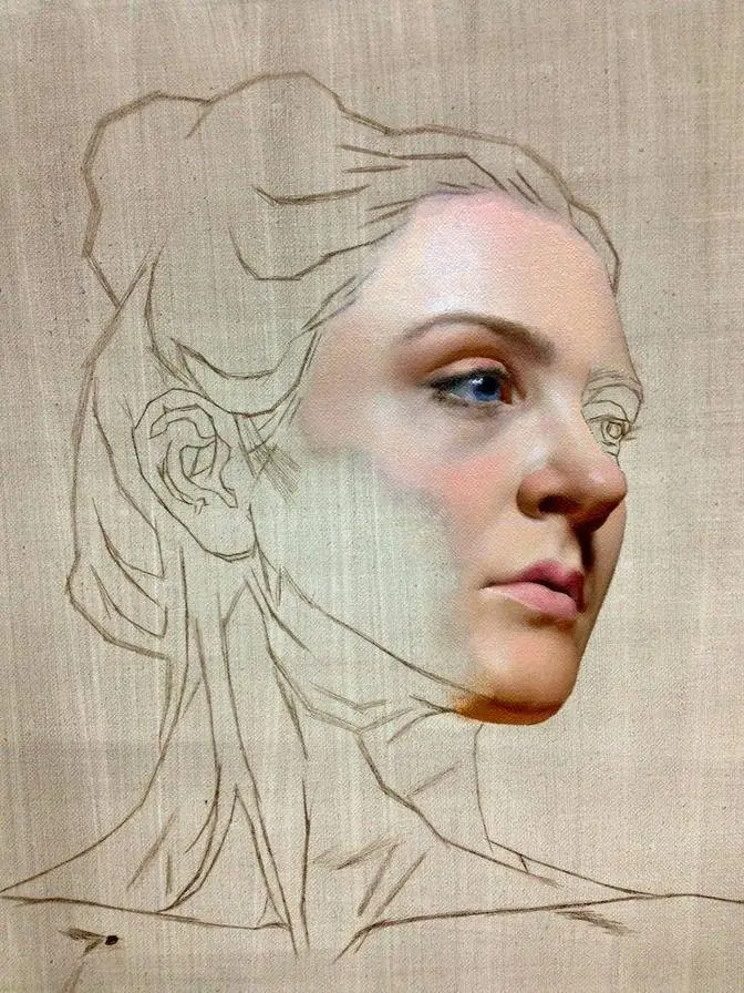
First we'll look at the outline, the underpainting, rich colour stage and the detail stage.
So be sure to watch it right through to the end because here and there I'll be slowing
things down in real time so we can take a closer look.
So let's dive in and take a look.
Now this is a beautiful reference image by Nina Carlson on Instagram.
So how I'm doing the outline is I'm using a centre point,
I've got a centre point on my board, centre point on the reference image,
and using the pencil very loosely and creating the big shapes first.
And then I'm using imaginary angles from that centre point.
And then once I'm happy with the outline done very loosely, then I tighten it up a little bit.
I'm happy with the position and now I'm checking the width with the height.
But what I'm going to do there is use a brush, because it's longer obviously,
and then just check the width against the height just so it puts your mind at rest,
that you're in proportion.
With the eyes, I do one eye first because I'm right-handed,
I tend to do the left hand first and then do the right.
The second eye is always a bit awkward to get that sort of shape correct.
But just comparing one shape with the other.
I'm using the pencil on a vertical plane as well,
checking against sort of things, some area against other areas.
And it's just basically just, it's a bit of Qigong to start with,
but eventually with perseverance and just going with the flow,
it tends to sort of come together in the end.
To see things as shapes rather than naming them as well,
because that keeps it nice and relaxed for you.
Right, for the underpainting then, these are the colours I'll be using.
Starting off with the warm red and white,
yellow ochre and red together,
and a little white,
yellow ochre on its own,
warm red and brown,
and ultramarine blue and brown for the shadow areas.
And then I'll mix a green with yellow ochre and ultramarine blue.
I tend to make it darker and then go to light,
because if you're desaturating the pink, you need light green.
Now for a zingy colour, I'm using warm red and lemon yellow,
which creates nice chroma.
And then like for a purple, I'm using ultramarine blue and alizin crimson,
just a little bit of purple, because there's all sorts of colours in skin tone.
Now for the medium, I'm using Liquin.
For the brushes, I'm using three number five round Hogair brushes,
three number two rounds,
a flat for the background, number five.
Now for the synthetic brushes, I'm using three number fours,
and three number two flats.
Before I start to paint, I like to ghost the outline
with a kneadable eraser, just to take the excess graphite off the surface.
Starting off using a synthetic number two flat,
just get a lot more control than using rounds.
And basically what I'm doing here is just getting the shape right.
All I'm doing is adding more pink when it's pinker,
more yellow where it's more yellower, and a bit of white to tint it.
And if I need to desaturate it at all,
I just add the green in the warmer areas and blue in the cooler areas.
Now this, like I say, this stage is all about getting the shapes right,
recorrecting the outline I've done.
Here I'm just going along the edge of the portrait,
and then I'll mix the background colour up,
just to get a little bit of contrast in there, just to get that background in.
Just adding a little bit of Liquin, just to improve the flow.
Just using that number five flat brush, hog hair brush,
just to get that pigment down quickly.
Now for these areas here, I'm using a mixture of green and red,
which create a shadow, natural shadow, there's a skin tone.
And then just keep changing that desaturated area up,
adding a bit more yellow here and a bit more red here,
just depending on what sort of colour it is.
And just step by step, just keep building it up.
I'm using the number two hog hair brush, just to roughly get these eyebrows in.
Using a mixture of burnt umber, blue and a little bit of red.
The reason I use three brushes is one for light,
one for mid-tone and one for dark, so you don't get everything muddy.
Just using hog hair brushes now, because it's easier to apply the paint,
you can push and pull the pigment around more,
rather than you can with a synthetic brush.
And you can blend it quite smooth as well with them.
Now for the white of the eyes, I'm using blue and the complementary colour, which is orange,
could create natural sort of greys.
And just keep changing it up where it's more bluer,
just add a bit more blue where it's sort of more warmer,
adding a bit more orange and a little bit of purple here and there.
For the darkness in the iris and pupil, I'm using brown and blue,
rather than black, so mix my own black using brown and blue.
And just getting the position right and just taking care just to reshape things.
Each stage makes the next stage easier.
I mean, this is just an underpainting, so it's very quickly put together,
and your basic colours.
But it just makes everything fresher than when this is dry
and I've put the rich colours on, which is later on in this video.
It's all fresher and it's more alive then.
For the lips, just doing the same sort of thing,
just changing it up if it's more redder,
just adding a bit more red and a bit more yellow when it's needed.
I'm using a little bit of cold red mixing with this as well,
so I tend to use two different reds when I do the lips, cold and warm together.
But what I'm doing here is mixing a bit of lemon yellow in as well
to try and get that bit of glow in just playing with these different colours.
If you enjoy this video, why not subscribe?
It's absolutely free and then you're sure not to miss any of my future videos.
Now for the dark areas in the lips, I'm using a mixture of green and red.
It creates a natural shadow and just varying it up where it's redder,
putting more red where it's more darker, adding more green to the mix.
I make sure that the actual reference image is small enough
so I can actually see the whole image, so I can see the energy.
Because what I tend to do is open my heart, let go of the mind,
so I've not really got blinkers on and trying to focus too much on detail.
I'm just bringing that energy of the reference image into my heart
and then it goes out my hands into the work.
So the more you can send this open heart energy to your reference image,
the more will shine back to you and you just let it flow from there.
And once you get used to this mixing of green and red to desaturate things,
it all becomes second nature after a while because all you're doing is mixing
a little bit more red, a little bit more yellow ochre or green or blue.
If you like the idea of actually seeing this portrait done real-time audio,
real-time video, so every part of the footage is recorded,
a Patreon link is in the description below.
And you'll get to really know exactly how I approach things moment by moment,
so please check that out after you've watched the video if you're interested.
The hair mixture is a burnt umber, ultramarine blue,
a bit of yellow ochre in there as well and a little bit of warm red,
all mixed together just in different sections.
As you feel the temperature change, just change it up a little bit and you mix.
How I do the hair is just focusing on shapes and movement and rhythm,
so you feel the flow of it, just block it in,
but I tend not to see it as hair and all that detail,
that will all come later on in the video,
just focus on just getting that shape right and the movement and the feel of it
and it becomes so much easier the next stage.
Now when you're doing the dress it's best just to see it as shapes again,
but you can't see much detail here so just paint what you see,
you know if you see a shape and a colour just put that sort of emphasis on there
and eventually to just shape up and the eye, the human eye will sort of fill in the gaps
and create it more detailed, it will feel it's detailed where it isn't,
it's just a suggestion of colours here and there.
So just be spontaneous with it and it's the same sort of mix as before,
you know it's just different combinations, brown and blue,
a bit of red and a bit of yellow ochre really, and a bit of warm red and cold red,
so it's all sorts of these different mixtures of colours.
Now in the reference image you can see creases, I'm not putting those in so I'm smoothing those out,
just got to put your sort of interpretation on it.
Now for the rich colour stage, starting off with another layer on the background,
very thinly does it, I've added a bit of Liquin in with that,
but just mixing in certain colours with it,
but all the subtleties and that will be put in on the detail stage.
Mixing the colours the same, just adding less white to make the colours more glowier,
they are sort of translucent colours I'll be putting on now,
and then in the detail stage they'll be more transparent and translucent.
The rich colour stage is all about getting the values right, the chroma right, the temperature,
so I'm focusing now more on getting a balance of the whole portrait,
so I'm working on certain areas and then blending the colours together.
So to desaturate the reds I'm using green, to saturate the orange it's more of a bluey green,
and for pinks it's more like light green.
So I'm laying the colour on and then wiping my brush and then using a dry brush to blend it in.
Shadows again is green and red together,
and if it's a bit warmer just adding that little bit of lemon yellow or yellow ochre.
Using number five round now just to blend all the area around the cheek here,
there's quite an interesting area this is because there's loads of different subtleties in there,
so I've mixed in now a lemon yellow and warm red to add them warmer areas,
where things glow adding that little bit of lemon yellow just does the trick.
Just using kitchen paper there, just turning the brush, wiping off that excess,
and then just blending the edges down, so you've got a little bit of paint on that brush
but it's not causing any issue, it's just blending in, that's how I feather things in,
so apply the paint, wipe the brush and then blend.
The rich colour stage is like a block-in still, I'm not focusing on the details,
that'll all be done later on in the video and the detail stage,
it's all about getting everything sort of balanced up with the values,
the temperature and how it glows.
I always think that it's best to leave the details until you're happy with everything,
because you can spend a lot of time doing something and then if it's wrong,
then you've got to go over it and you spent all that time putting all those details in,
so I always leave the details till the end until I've got everything balanced up.
Now what I do a lot of when I'm doing the rich colour stage and the detail stage,
is to look in a mirror, so I stand with my back towards the painting,
with the mirror in front of me and I'm looking over the shoulder,
so I see the reflection of my work plus the reference image and I can compare as a flip image,
it brings out certain areas that you're not aware of,
because you get used to seeing it at one direction,
so if you can just flip the image looking through the mirror makes all the difference.
If you're enjoying this video why not give it a like and share it with your friends,
it would mean so much to me as this would help the channel to grow.
To see the values squint your eyes and to see the colour open your eyes,
so that's a little tip for you there, so if you're not sure on the values,
squinting your eyes it just sort of brings them all out
and I'm forever comparing one area with another area so it gets a balance.
Now apply more paint, thicker paint to the highlighted areas
and as it goes towards the mid-tone and shadows it gets thinner and thinner.
With the eyes just focus on putting that little bit more richer colour in there,
so here's a bit of real time just to show you how I'm applying that paint,
just using that sort of flat synthetic brush,
so you can use the corner of it or the side of it to create a sharp line,
just putting those sort of details in the iris there.
Now I'm adding a bit of lemon yellow, a bit of cold red in there as well,
creating different subtleties, it's a case of playing around with these colours really
until it starts to feel right, there's no easy way of doing it, it's just a case of
just jumping in and having a go. It's all similar sort of colours,
just different proportions of the mix.
Applying these colours very thinly so it creates a more of a warmer feel to it.
I'm not interested or concerned about getting everything exactly the same as a reference image,
it's my interpretation at the end of the day, it's just a suggestion of these sort of areas,
you know, different subtleties. You just put your sort of slant on it really.
Just slide it down a little now, the brush I'm using is a synthetic round number two,
and so subtly just changing these areas up here and there.
Using number four flat now on the hair strands, it's surprising what detail you can put in using
these flats because you can use the corner for little dots and then the side for really fine
lines. And all it is really again is just placing those values and subtleties in, but the details
will all be put in later on in the video on the detail stage. It's just preparing your way now,
just getting the temperature something more like and the value. It all adds to the final result,
keep adding these layers. I'd just like to take this opportunity to thank all my patrons for all
their wonderful support every month, can't thank you enough. If you're considering joining me on
Patreon I'm glad the benefit of all the footage, everything in real-time audio, real-time video,
so you get a feel for everything I do step by step and I discuss it as I go along. So if you're
interested in that the link is in the description below for more details. Now for the headdress,
I put the background in very thinly then just wiped off the excess paint so it makes it easier
then to apply these details rather than just going on to straight dry board. That's why I left it
until this time so I can add that background and then put all these details in. I've added a little
bit of Burnt Sienna in the mix with this just to create that sort of nice greys because Burnt
Sienna and Ultramarine Blue together make lovely greys and then if it's more of a colder grey you
just add more blue and if it's more warmer you add more Burnt Sienna with a bit of Yellow Ochre
in there as well. Now I'm not trying to do it exactly like the reference image here and it's
my interpretation so I'm just being loose with it and sort of spontaneous rather than trying to
put every little detail the same. It creates more of a sort of flow to the actual painting then.
Now creating an orange for the gold by using Burnt Sienna Lemon Yellow then using the blue
to desaturate it and create a greeny gold and it's just a case of being very suggestive and
again it's just your interpretation of it because there's not much details in here
it's just a little blob of colour here and there. So just paint what you see and just enjoy the
freedom of just not having to put every detail in exactly like the reference image. The same applies
to the clothes. You can't see much detail in the reference so it's best to really just
paint what you see. A blob of colour here and there getting the highlights and focusing on
the value and temperature and getting a feel for it because all the chroma can be adjusted
in the detail stage so if you focus on trying to get that feeling that it actually feels
like fabric and getting that sort of value right it will make all the difference in the next stage.
Again applying thicker paint in the highlights thinner paints in the mid-tones and shadows.
The palette is set up with the same colour combination same method for laying the colours
out but less white because this stage it's more transparent the colours are and a little
translucent so less white will create more glow. Because I live in the UK and the EU rules is that
you can't use lead white. Now if you can use lead white I would recommend putting 50 50
lead white and titanium white which will create a pearly glow to your work and you could add that
little bit more white if you wish to then. It's just that titanium white tends to make the colours
look a bit chalky. If you might want to pause this just to check the brushes I'll be using for the
detail stage. Starting off with the eyes and I'm just putting those darker areas in there just
being aware that the subtle changes in the value. To create the darkest value I'm using brown
and blue with a little bit of lemon yellow because it's like a greeny blue colour to the eyes.
So you'll have to look at the temperature some areas more bluer some are more sort of greenier
yellower so you're just changing the mix as you as you apply. So I'm mixing actually paint on the
canvas like a wood if it were like pastels so you can't always get the colour mixed on the palette
exact you just have to play about with it and change it up as you go on the canvas itself.
I always tend to work on the eyes at the same time just to make sure I get the same balance
within each eye. Now how I'm applying this is just adding that little bit of liquid
but not too much that it makes it slippery because you can't work with it then. I'm more or less
scrubbing it in there over the paint I've already done previous stage because it's dry that colour
is coming through the paint I'm putting on so it's all working together you see that's why I
like to work in layers because the colour you put on top changes with the colour underneath so you're
playing with that sort of idea as well so you you're mixing your colours adding subtleties
by changing the colour what was previously on there if that makes sense. At this stage I'm
very aware of the temperature changes as well so as I go along I'm adding more yellow for more
warmer areas and I'm adding that touch of green or blue to create cooler areas and just blending
as I go along so I'm applying the paint wipe the brush and then use the dry brush to actually
soften the area. Now using a flat brush here synthetic flat to get the sort of details of
the eyebrows I want to keep it loose and not too detailed but I'm also using a thin synthetic
round as well so it's a combination of two brush types so I'm not trying to make it exactly the
same as a reference image it's my interpretation of it and it's just to create a soft feel to it
because if you put too many details in here and not everywhere else it will stand out too much
it'll look like caterpillars on top of the eyes so everything has to be balanced so I try and work
on the whole painting different areas to create this balance so it all seems like a feeling of
aliveness rather than loads of details. Now the corner of the eyes are quite interesting they're
very watery looking and there's always this sort of red sort ofness in there with a little bit of
highlight so I'm desaturating the red with the green and just using those pinks maybe with a
little bit of lemon yellow mixed in with that as well just to create that sort of glowness to it
and and just keep persevering really and just trying to get a balance of the temperatures
the way there's a lot going off in the detail stage. Just to mention if you want to see this
portrait all in real time time audio real time video it is on my Patreon link is in the description
below here's a little taster for you it's only a very small clip let's just see what's gonna be
about here just take your time don't rush it be sure to check out the link in the description
below if you're interested in knowing more about my Patreon page it's a very small amount each
month and you get access to every video on there. Using the hog hair round now just to create these
subtleties in the neck and the shadow areas just adding that little bit of lighter paint and then
scrubbing it in to what's already been done previously it creates like a really nice sort of
misty feel to it and then it's just a case to just keep playing with these temperatures
and just achieving the overall feel of the portrait. Now I'm putting a very light mix on top
of the existing background here just a little bit of Liquin in just scrubbing it all in
just placing a little bit of pigment there so when I start putting the hairs over the background it
will be easier to apply then just adding a bit of warmth on this side of the neck here so it flows
behind her then so the colour flows through. Now I'm using a rigger brush here just to add
these little wisps of hair initially I'm just putting one shade down but then eventually I'll
go over that with different shades and put little bits of highlights and glints here and there
so you change it up and eventually it starts to look more natural then. If you enjoyed this video
why not give it a like and share it with your friends it would mean so much to me as this would
help the channel to grow. These are the overall details so I'm doing little bits of highlights
here and there just changing the values here and there as well it's just a matter of getting the
overall balance so it's just going over what I've already done earlier on in the detail stage
but just making sure I'm adding those extra details. It's surprising what a little bit of a
glint here and there and just a subtle change makes all the difference you don't have to put
everything in there just enough just to make it believable really. Just adding a little bit more
depth to the shadows in the ear here before I start putting little bits of hair everywhere
it'll help for the flow of the pigment as well so again just a little bit of glints. Visually the
hair looks like it's broken lines so what I'm doing here is just putting the odd little glint
and a little bits of temperature changes so I'm mixing as I go along I'm using a flat brush as
well so make sure when you do mix it on your palette you make it the brush really flat and
chiseled so you can get these really fine lines rather than using a rigger brush. Now I'm just
going over the headdress here now just adding that little bit more fine details mixing burnt
sienna and lemon yellow to make a gold but then desaturating that with the blue and the brown so
it's a mixture of all sorts of things there's purples in there as well so I've got a blue
and alizarin crimson mix and again I'm mixing on the actual canvas itself. For the stems I'm adding
the ultramarine blue and burnt umber for the lighter stems it's just ultramarine blue and
yellow ochre and a little red to desaturate it if I need it. Just getting that shimmery feel now to
the actual clothes again just a little suggestion here and there does all the trick you need
I'll try not to get every detail the same there's not much detail you can see anyway so just paint
what you see and just be quite sort of flowing with it really. Just looking at the temperature
some areas are bluer some are more pink here you just got to really feel the temperature and go
from there. Putting those final touches it makes all the difference just an odd little temperature
change here and there. I'd look in the mirror a lot sometimes I take the painting into another
room see how it feels in that environment and also have a little break come back to it
and just really try and get those sort of feeling of the overall energy and you get that by just
opening your heart and just coming from there rather than overthinking it. Getting the glint
now with the earrings just using that lemon yellow and burnt sienna together. Thank you so much for
watching the video right till the end hope you've enjoyed it if there's any questions at all please
leave a message in the comment section below this video and I'll get back to you as soon as I can.
In the meantime if you want to see any more of my work please check out this video here.
Take care, bye!