
Portrait Painting From Life in Oils
May 3, 2026
Welcome back to the studio and welcome to another painting tutorial.
We're going to be painting this portrait of my editor Nick.
Now Nick, I just thought, deserved a painting.
And I started painting this live for my academy members.
I'll show you a shortened version here.
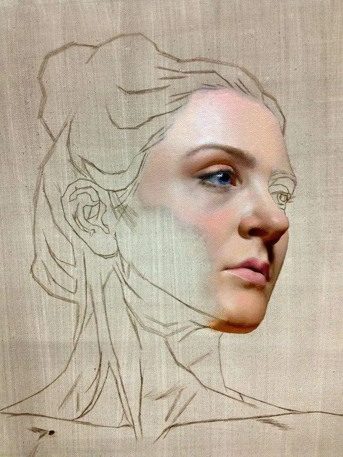
Step one is to solidify your shape, identify your zones,
and get all those key features mapped out in the right place.
There's a little bit of a process to this,
but I'm doing a combination of both the Loomis method
and adjusting by comparing one shape to another.
What this does is gives me a really solid framework
and I'm sketching with a brush.
From here, I map out where those shadows are going to occur,
some of those darker passages in my portrait.
And you can see here, we've lit Nick high and to the side,
giving some really nice shadows under the nose, eyes, and chin.
Now what we need first is a little bit of context.
Notice how Nick here is on a dark background.
I feel this pulls a lot of that light out of the face.
It gives us a little bit of comparison.
So it makes those brights feel a little bit brighter.
I'm going to use a combination of ultramarine blue, cobalt blue,
some chromium green oxide, and burnt umber.
Yeah, I know I'm making green mud, but there's a method to my badness.
Now here, I'm going for a really off green color,
very dark tonally speaking,
because I want to make, by comparison,
the flesh tones appear a little warmer and a little bit richer.
I block this in roughly with a bristle dagger brush,
the Tisch dagger, of course.
By the way, you can find links to all my materials
in the description down below.
Once I've blocked in my background,
I smooth out this paint layer with a large synthetic brush.
It still has plenty of brushwork in there,
lots of character, as I like to paint with my portraits.
And now let's map out a few more of these dark shadows,
starting with the collar.
I like to work around the face first,
but it's not that this is a rule.
It's just a preference.
I find that this gives me a better place
in which to judge some of those lighter values
that occur in the face.
For even more context, I'm going to move on to the hair now.
And so I'm going to mix up the shadows first,
a combination of ultramarine blue and burnt umber.
A little bit heavier on the burnt umber though.
I map out where those darker tones occur first,
and then a slightly lighter brown note
with white and more umber.
And just like I did with the background,
I smooth this out with a large flat synthetic brush.
I try to move in direction of the hair.
It just gives that effect right off the get-go.
And I will come back later and apply
some much lighter strands of hair
and separate with some more darks.
Now I use a whole range of earth colors on my palette.
I've got burnt umber, transparent red oxide,
transparent yellow oxide, and raw sienna.
And I find this really helps me with my skin tones.
Here with an extra long bristle filbert brush,
I then start to map out the shadows on the face.
Now I found early on when I first started painting portraits,
I had the continual same problem.
It just came up again and again.
My portraits looked really flat
and I could never work my way through that ugly phase.
Now maybe you're from a different school of thinking here
and maybe you feel like there shouldn't be
an ugly phase in the portrait.
But sometimes my portraits start off looking like this,
but it all comes together in the end.
For me, it's just about trusting that process.
Get those darks in there first
and have something to judge those lighter values
and colors against.
So I work my way around the face,
trying to identify and to the best of my ability,
try to map out some of the cools and the warms
that I'm seeing in those shadows
whilst maintaining the location of key features
and that essential character.
Now this whole process here,
the first part of this demonstration was painted live.
We do weekly live streams on Tisch Academy.
So if you want to be part of that,
click that link in the description down below.
There's tons of content to get into
from landscape to seascape to still life
and the occasional portrait.
And there's over 400 hours of premium painting content.
So check it out by visiting tisch.academy
or click that link down below.
So for some of the warms here,
I'm using transparent yellow oxide
and a couple of whites.
I've got titanium white and criminance white,
which is a lead based white.
Now don't be scared by the lead white.
This is a beautiful color
when it comes to painting portraits.
Yes, it's real lead.
Lead carbonate is the basis of that pigment in there.
And it's gorgeous in its transparency.
I find that this has really helped me
mix some beautiful transparent skin tones.
So I build up most of the form using this paint.
Now, if you're worried about toxicity,
well, just know I am too.
It doesn't release a lead fume at all into the studio.
As long as I don't get it on my skin
and just get it where it counts on the painting,
that's the main thing.
But one thing I find with the lead
is that it stops my skin tones from going too chalky,
as can happen when you're using just titanium white.
You can paint a beautiful portrait with titanium, of course,
but having a little bit of lead certainly helps.
And this mixes in beautifully with those transparent oxides.
It gives me a really fast way for achieving those skin tones.
Now, at this stage in the portrait,
I'm not worried about painting Nick's stubble
that can be found around his jawline and chin.
I just go for that base tone.
So it's a little bit of a cooler shift
in some of those skin tones as we travel downwards.
I wanted to keep the brushwork here
relatively fresh and expressive
and have plenty of movement in that surface,
trying to use my brush to contour with the forms
that can be found in Nick's face.
Now, he did a pretty good job here
holding nice and still for me throughout this demonstration,
for which I'm quite grateful.
He's a trooper.
He sat still for the full five-hour livestream.
Now, I'll also use a little bit of cadmium red light
and permanent crimson
if I require a bit of a warmer flush.
I saw some warmer notes down here in the neck
and I work back into this with more lead white,
a little ultramarine blue,
as well as permanent crimson and raw sienna.
Now, I find the extra long bristle brushes
have been really helping me with some control
with that really nice brushwork.
Here, I'm using a number four.
But pretty soon in the process,
as I need to hone in on those final details,
I'll move to a number two.
And of course, I have a wide range of filberts
that are synthetics as well
for some of the finer features.
Now, when painting a portrait,
it's important, as I said, not to be in a rush.
Take your time with this.
But a general rule of thumb has really helped me.
Start with those general big shapes first
and work your way towards specifics.
This has really helped me in seeing that big picture.
If the big shapes are in the right place,
then those little shapes will take care of themselves.
So it's the next sitting here
and the paint is still nice and pliable.
I can work between some of those brush marks.
I'm going to work from a little bit of photographic reference now,
which I shot during that sitting with Nick.
I'm going to work on some of those finer features.
This time, moving to a bristle dagger brush.
Now here, I'm going to mix up a bit of a lighter tone,
which is that titanium white and criminance white,
adding to it a touch of permanent crimson
and cadmium red light
and the slightest amount of cobalt teal.
Oftentimes, when I'm looking at the portrait,
I'm noticing slight color shifts in the light.
Reflecting off the skin
and a balancing between the warm and the cool.
When you get up close to your painting,
you should see a wide range of those colors.
In fact, next time you're studying your friends or family up close,
have a look at how many different colors
you can see in their skin.
It's quite extraordinary.
One thing I focus on when painting a portrait
is the edge quality.
How one brush stroke meets another.
These softer extra long filberts
have really helped by blending slightly across edges.
I don't want to completely blend everything out
into a smooth surface.
Again, I want plenty of character to remain in my portrait.
Now it might just be a bit of a tish thing,
but most of my male sitters are wearing colored shirts.
I just love the structure of the color,
those pops of light and dark,
and some of the sharp edges that you can get.
It frames the painting nicely,
and I just love the interest here,
particularly getting lost in all of that brushwork.
And this denim shirt was pretty interesting.
So I start off by painting in some of those shadows
as you saw me do before,
and then with broad strokes,
I get plenty of character in my marks.
Here, a combination of ultramarine blue and white,
along with some cobalt teal,
and just a touch of quinacridone.
I make sure I vary that surface
and try and form that brush
so it contours with the shape I'm trying to communicate.
Across those edges where it meets the background,
I smooth ever so slightly.
Rosemary sent me some of these extra long combers here,
which are perfect for that job of smoothing between edges.
Now I start traveling around that face,
adjusting edges and shadows,
making sure I've got the right turn in the form.
As I sit back and I'm looking at my portrait from a distance,
I'm noticing any areas that might appear flat or slightly skewed.
Now's my chance to go in
and just realign some of these shapes
in case I'm slightly off.
But I know if I just define a little bit here and there,
I might lock in that character.
I feel pretty good about the location of this eye,
so I go ahead and send it
and just apply a few of those final details.
Try not to get too detailed, though.
I still want it to look nice and painterly.
Here I'm using a smaller, finer synthetic brush,
which is great for precision and control,
locking in some of those key characteristics
in the iris and the eyelids.
In other areas, like here in this eye that's in the shadow,
I want this to kind of drop away
and be a little less defined.
Now let's mix up a little bit more dark tone,
a bit of quinacridone,
some ultramarine blue,
and burnt umber.
We'll start to separate the mustache
and even work some of this into the hair
to define individual strands and clumps of hair.
I'll even work this into the eyebrows
and adjust the edge where the hairline meets the face.
So working in that same fashion of general towards specifics,
now I start to really hone in on those key features.
I'll adjust a few of these edges in the neck
and then we'll start to define with a little more clarity
areas in the face like the lips, the nostrils,
working around those eyelids and the ear a bit more.
An ivory dagger does a great job
for individual strands of hair.
I try not to overdo this,
making sure I keep really nice, clean brushwork.
Occasionally, I'll use a trimmed fan brush.
This can really help with interesting textures like stubble.
I'll work this right over the face
and apply a few finer highlights to the eyes.
And then just for a last few little details,
I'll even add one of these pearl snap buttons to Nick's shirt.
I really hope you've enjoyed this painting demonstration
as much as I've enjoyed spending this time
with you here in the studio.
Remember, you can always learn more
and find out more about my portrait painting techniques
by joining Tisch Academy.
You'll see this video in full at two hours long
and you'll get that with your membership to Tisch Academy.
But there's a lot more that we have to talk about,
so I'll see you there.
Click that link down below and let's get painting.
Thanks for joining me.