
How To Paint REALISTIC Skin (Luminous Skin Tutorial)
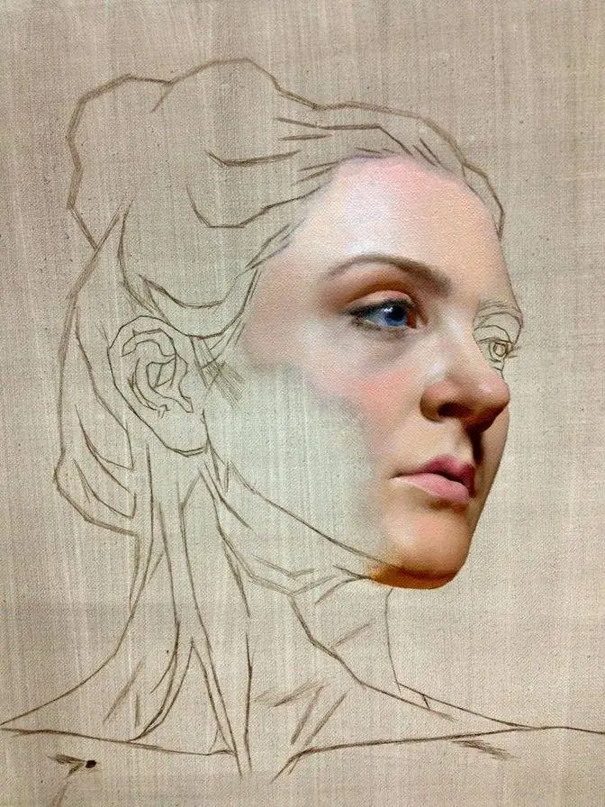
#GJWart #portraitpainting #portraitart #oilpainting #oilpaint #potrait #painting #drawing #art #arts #traditionalart
AI GeneratedMay contain errors
Video Summary
AI GeneratedThe artist demonstrates an alla prima portrait painting technique, focusing on experimentation, color vibrancy, and three-dimensional form. By prioritizing temperature shifts and value hierarchy over strict likeness, the artist uses thick paint application and a mix of tools to create a dynamic, translucent skin effect in a single session.
okay this is the reference and this is what i see when i squint and i've decided that i don't want
to paint this gray wall which i see on the reference it looks pretty boring so i've decided
to combine the dark shapes all together and to work with the shapes with the shadows towards
cooler red side normally i start with Romer but in this case i've decided to go directly with
with the mixture i would like to see in the in the final painting i'm using the biggest brush
which i have in studio normally i use this brush for grounds but i thought it could be just funny
to work with a big brush and with the other tools so sometimes it's just nice to create such
textures by scrubbing it in and scraping the paint off this painting is more about
experimentation than the result so i feel myself really free here i don't care about likeness
what i'm really focused on is how to make colors more interesting more vibrant and how to paint
this portrait with a thicker paint but so far you see it's more like adding and removing
with both with brush and with the card and sometimes with other things and for me i don't
for me the background looks already quite interesting and you can see on the top right
corner it is already dry so it is also quite interesting effect of working very very thinly
in the beginning so i continue to squint and i i just try to find the proper balance between the
modeling modeling very very approximate shapes for now but every time every time i deal with a
three-quarter lighting or something similar i'm really focused on making one side of the face
one side of the head lighter than other side of the head i mean in the light so the the most
important difference should be between the halftones in the light the the planes which
are next to the core shadow should be darker than the opposite plate it will it will create
really strong illusion of three-dimensionality of the head and i highly recommend to focus on
difference in the values of the lights because it is very easy to find the difference between
the shadows and the lights in the beginning but the difference in in the halftones in the light
it is more important for for proper representation or at least equally important so here as you can
see on the palette i mix a lot so i load these brushes and i apply very thick layers of
paint right away and instead of instead of choosing proper value and proper
mixture i go very free and i try to i try to amplify what i see to make mixture lighter
and more saturated to push it in in terms of color and temperature and just to work with the
with the paint on on the canvas on the panel not not on the palette so the actual mixing is
happening on the panel as well and if i want to fix something let's say i want to make value
darker or i want to change the design of the shape i don't erase and i'm not scrape away
the paint i i blend what already is there and i try to to work slightly more like a sculpture
sculptor here just shaping moving adding and it is really essential to
to organize your brushes here because you don't want to contaminate the big pile of
paint which you are which you have on the panel so few brushes for the lights few brushes for darks
and be very careful do not do not mess them up so as you can see i use i try to create
um complementary complementary vibrancy here using some greens in the halftones especially
in transitional halftones because i have some reds in the shadows and i'm obviously have some
reds in the lips and the nose and the cheekbones some beautiful things and i don't want to create
monotonous monochromatic painting so the best way is to introduce some greens to create additional
vibrancy and to see how i can change the temperatures warm to cool warm to cool this
type of so uh we have warm shadow the transitional halftone is going to be cool kind of green after
that warm halftone in the light again and the cool pink halftone or lightest halftone in the
light and finally some yellow highlights or something and you see the deepest darks like
occlusions or the the background mixture which i'm using now to to create a silhouette of the head
is again cooler than the shadow so it is cool warm cool warm cool color skin
which can be really pleasing so now you see that i still use the card to create nice nice brush marks
because i i like to have the skin smoothly rendered especially in the lips and the nose
round eyes but outwards from the focal point it is very pleasing for my eye to see some kind of
dynamic composition some kind of chaotic representation so i try to combine in this
sketch i try to combine abstract and realistic approach one i wanted to look fresh
like through our primo painting so this this one is uh had no second layer everything was done
in the single sitting just in in one session and i really like the outcome so i constantly make
decisions about maybe i should smooth things out so i'm using fan brush or bigger brushes
or just a lot of brush work to to blend it with the long filbers which i use now on the video
and every time i want to introduce smaller plane changes like subtle planes or smaller planes
i try to constantly change the temperature so you can see some gray on top of the orange
or some pinks on top of the of the reds oh i'm sorry of the blues or vice versa if there are
a lot of yellow there will go some blue or if it is too cool i will just apply something warmer
like in the cheekbone there as you can see on the palette i i clean the palette very often
in this sketch and this this is important normally i don't do that but here with a
thicker paint application i'm i try i try to be in control if you paint thinly and you do mistake
you can just paint over the the area and fix fix the problem but if the area is painted already
thickly yeah it is going to be a trouble if you mess up the temperature as i already said before
and as usual i make the darks darker during the process so i don't jump into the darkest darks
right away and i don't do and i don't apply lightest lights neither although it is also
yeah this is absolutely possible to paint the way when you when you mail down the darks and
lights right away but for me i prefer to build the form gradually so smoothing out
transitions and it is very easy to do if if you have thick paint application so more paint when
it is wet easier to to make things make transitions smoother or just to control
to control gradation if you need to and all these layers all these different mixtures now they are
blending into each other creating nice translucent effect of the skin which which i'm looking for
as usual the highlights in the eyes with the with the sharpest tool i have with the tip of
the palette knife so technically all the decisions all important decisions were made in the very
beginning it is a placement of the head on the canvas on the panel decision of the combining
the value and the color of the background and now just separating two darks using darker and
cooler dark for the for the shadows and the rest is just is just building up and rendering
and also quite important thing here is a difference in halftones you can see clearly now
the right part of the face right for us is clearly lighter than the than the left part
which is also part of the light family of values so now clean the palette again
i don't know how many times already three times in three hours
clean and also using clean brushes in the beginning i was using mostly ivories because they
they can be loaded very very heavily we can we can load a lot of pigments into ivory
and now i use long field birds kind of synthetic mongoose brushes for delicate brushwork for
precision in the brush marks and for smoothing out yeah like that you see so if if you did mistake
you can just carefully blend the problem problem brush mark in into into existing layer of wet
paint and when it comes to colors the most important is to just to maintain warm and
cool relationships between the different mixtures and different values i believe it is more important
than trying to copy the colors which you see all on the floor when you paint from life it is
it can be okay to to copy the colors but photograph is not the best source of the color
so now with the with the just with the background with the with the composition you see i have
red and green just for the sake of variety yeah now it's time for the highlight and and you can
see now on the forehead i have lightest light which is yellow on top of the pink so i i like
to do such complex highlights because they they gradually build build the value towards the very
small spot which is technically just a reflection of the light source but if you keep the temperatures
on opposite sides of the wheel it will create additional vibrancy in the highlight
quite opposite to chalky effect which you can see many times when when you just use a lot of
titanium white in the light and i i use this lightest light only in that part of the head
because every time when the light source is situated above and we can clearly see it
by just looking at the shadows especially the cast shadow on the nose so every time the
light is not frontal there should be just one side of the face in this case it's
right right side of the forehead which is which has the actual lightest light
so everything down below especially the chin way darker this is absolutely important
just applying few lights in the cheekbone and and the chin will will ruin the illusion
of the head the proper three-dimensional illusion so keep your eye on your value hierarchy all the
time in the beginning in the middle of the process and especially in the end because
these decisions then yes you're going to sign it and if it is our prima it is going to be there
so just modeling applying more highlights some purples for the hair
i deliberately ignored the piercing in her nose because for a prima for just one sitting
session it is better to sacrifice such things and to concentrate on on the skin tones
proper head representation you can always add some such things later because if if if you want
to be successful in our prima as i as i've learned by myself you have to be very strategic with your
time so when i paint from life i constantly look at my watches and i and i create some kind of plan
and a schedule so i break three hours into certain segments blocking the values
approximate colors for the light and finally so this is pretty much it i hope you liked it
there is a longer version which is edited and clean so i highly recommend to watch it if you
have any questions just send me a message on discord or through patreon and see you next time
thank you so much for watching bye