
How To Mix Skin Tones | Oil Painting with Arthur Gain
#GJWart #portraitpainting #portraitart #oilpainting #oilpaint #potrait #painting #drawing #art #arts #traditionalart
AI GeneratedMay contain errors
Today we are going to talk about palette organization
and mixing of the skin tones.
I will show you how I approach mixing on the go,
especially when I do direct painting or a primer painting.
And we will be doing some pre-mixes,
not pre-mixes, just mixes.
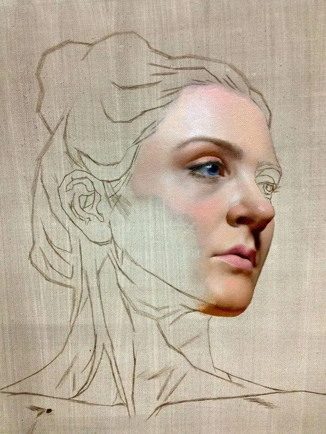
And I will also, I will use one of my painting
as a reference for the skin tones.
And I will probably explain certain ideas
and certain methods and my approach
using this painting as a reference.
So first, let's talk about how I approach
my palette organization.
I have, and I will repeat the colors,
this is technically essential palette,
can be wider, can be shorter,
but it consists of three primary,
as any palette, as any palette which is going to be used
for representational painting,
we will need three primaries.
We have yellow primary, red primary, and blue primary.
And I place them, I group them together,
and I also group them with values.
So lighter values, they are closer to the left,
except for this transparent red oxide.
Mid-tone values are in the center,
and dark values are on the right.
So when I mix, I'm mixing naturally my lights here
on the left side of the palette,
my darks here on the right side of the palette,
and something like mid-tones I'm mixing in between,
which helps me to organize my mixtures
and also helps me to know,
like I always know where my hand should go
to pick up light or dark,
so it helps with efficiency.
So when we talk about different colors,
you see we have two yellow colors,
nickel titanium and yellow ochre.
One is lighter, one is darker.
One looks cooler, and another one looks warmer.
And as you can see for all three primaries,
I have the same idea, I have similar approach.
We can say that transparent red oxide
is somehow in between yellow primary and red primary.
Sometimes I think of it as red primary pigment.
Sometimes I think about it like orange.
So I think kind of orange is the best explanation
for transparent red oxide.
Here is cadmium red light and alizarin crimson.
One is lighter and warmer,
another one is darker and cooler.
So temperatures are different for these two colors,
and sometimes I need to alter my mixture,
my red mixture, for example.
I want it to look slightly warmer,
so I will probably add this,
or if I want it to look slightly colder,
I will probably add that.
And another reason to have both of them on the palette,
this one is opaque, and this one is transparent.
So if I'm going to mix something transparent,
I have transparent red oxide.
I have alizarin crimson.
Ultramarine blue is also transparent.
Ivory black is opaque, and lumber is opaque.
So you can see how we can control the transparency
of different mixtures by using more or less opaque
or transparent colors to mix.
Sometimes I can add transparent yellow oxide
as my transparent yellow or Indian yellow,
but usually it's enough to have transparent red oxide,
in my opinion, and yeah.
So we can control opacity of our mixtures.
Forgot to mention this King's blue light.
Despite being blue primary,
I keep it just under the white usually,
because it is very light, light value pigment.
So I'm using it as altering agent for the light mixtures.
And since it contains titanium white in itself,
I don't want this to be around these colors,
because adding King's blue light into the shadow
can contaminate and make shadow look more chalky.
So it is why I keep it here.
The same with other very light pigments.
I have a few of them.
So let's try to talk about, let's talk about the skin tones,
and let's mix something like this forehead approximate
value for the forehead.
I was using slightly different pigments
when I was painting this portrait,
but it doesn't really matter.
We are going to just paint something approximate.
And I'm going to show you how I approach first mixing
and after altering of the mixture.
So in the beginning, I always want to mix more than I need
and paler than I need.
So as general as possible.
So I'm stepping back.
I slightly squint to determine this color
and value of the forehead.
So I'm using nickel titanium.
I'm using yellow ochre, a bit of transparent red oxide,
titanium white, and you see now I've started with whites
because we are going to talk mostly about altering
the light skin tones.
So I'm mixing something like this.
I feel, I also can just carefully bring it closer
to the painting to see what should be changed.
And I feel like maybe I want to add a bit
of transparent red oxide and mix it with king's blue again.
So you see these two pigments, they are complimentary.
So we can have very neutral looking skin tone.
Yeah, now it is matching more or less like here.
We can see how does it match.
So let's say this is our pale skin mixture.
And we also can see that there are other mixtures,
other colors in the skin in this portrait.
Of course, there are darks,
there are also transitional halftones,
some greens, some pinks in the cheek.
So what do I do?
I mix this, for example,
and now I start to add on the peripheral,
I'm adding a bit of red.
So I'm just dragging this cadmium red down like this.
And I'm creating with palette knife,
I'm creating now few steps between original pile
and this cadmium red light thing.
So you see now I have original pile,
I have lighter red here and something in between.
I already have at least three different steps
of this mixture, three different variations of it.
And it is why I need to mix more than I think
I'm going to use because now we can spread
this initial pile out.
So now let's just use this green.
I'm adding this green here
and I'm also adding more red here in between.
And now I want to create the bridge between green and red.
And you see it is getting darker
so I'm adding a bit of nickel titanium into the mixture
to bring the values closer.
So now we have this original pile,
we have greener version of it
but the value remains almost the same.
And here on peripheral, I'm adding more green.
So I also have one step or two steps down in value.
I'm stepping back to see maybe now I want to use my knife,
palette knife, to create softer transition.
So I can just pick up from this pile
different thickness, especially with soft brush.
We can also add some yellow ochre here on this side.
Mix it with a bit of titanium white to match the values.
And now we have very similar values of original pile
and this new yellow, bright yellow pile.
And I'm also adding it into original pile.
So starting with very pale skin tone mixture,
I already have few different variations of the skin
which can be used in the painting.
So my advice is to practice such method
when you start with very basic general skin tone first
and you alter this skin tone mixture
with yellow, red, and blue primary pigments
and you can constantly check the values
of this additional mixture
so you can control how close the values are.
So I'm remixing this initial pile,
making it a bit darker now just to have more of it.
So the idea in the light of the skin,
the idea is to use very subtle variations
in temperature or color while keeping the values
almost the same, especially for luminous skin.
If we want to achieve this effect of luminosity in the skin,
you can see here in the forehead there are some blue marks.
Here there are some slightly green marks
in the cheekbone structure here and around the nose.
There are many different colors of different saturation
and different hue, but the value remains almost the same.
And it is how I prefer to render the skin in the light.
This method will help you to think less
about matching the values because you already
matching the values on your palette.
So now let's quickly mix some darks.
So you see how dark transparent red oxide
and ultramarine blue mixture looks like.
So we have this now and we can say
that probably it is going to be our darkest dark.
It is going to work, but what if we need it
to be slightly lighter?
For example, the shadow in the inside of the eye socket.
So now I'm altering this mixture of the dark
and I'm adding opaque light comparing to this.
This cadmium red is very, very, very light, very bright.
So I'm adding this instead of any of that
because if I'm adding this, for example,
this or that, or even yellow ochre,
it is going to be overkill.
So let's have a look like this.
If we're adding these values, you see the result
is immediately contradicting with light values.
So it looks too bright to be a shadow.
So if you need to lighten the shadows,
if you need to lighten your dark mixture,
use something relatively lighter, but not extremely light
so you will keep the separation of the two families intact.
So now when we have, let's mix it again,
when we have this extreme dark mixture here,
and I can control, I can add more ultramarine
and it will look colder, very bluish.
And here I'm adding more transparent red oxide
and it looks a bit warmer.
I can also add green.
So I have two variations of this dark, colder and warmer.
And now with cadmium red light,
I can make this shadow lighter.
So I'm adding even more,
and I'm also adding a bit of viridian
to knock down the redness of the cadmium
while keeping the value almost the same.
And now I have a bit more neutral brown here,
but still this shadow is much lighter than that.
And also it is a bit warmer.
Now I can add yellow ochre as my next step to this.
And you see, and now it is already a halftone.
Can be transitional halftone.
I can also add viridian here.
And now we have this very interesting looking green,
which is perfect for transitions in the skin.
And for example, yeah,
we also can add a bit of alizarin crimson.
And now we have dark purple.
So you see, again, variety for the dark group.
And finally, if we need,
and we also can just add some blues here.
So you see, the idea is of spreading the same value
outside of the initial pile to maintain the value range.
And now I can also start blending
these two groups together on peripherals.
So I'm keeping my darks untouched.
I'm keeping my lights untouched.
But now, since I have plenty of the colors,
plenty of the mixtures,
I can start looking for transitions
and like midpoints between darks and lights.
So we can quickly have this idea of transitional halftones.
And all the mixtures are going to be pretty much harmonized
because we were using all the colors
in all the mixtures more or less,
especially for this transitional stuff.
Can add a bit of red here.
So we can play with such mixing a lot.
And now if we start to look into the painting,
we can just find, for example,
this somewhere here near the cheekbones.
I see a lot of similarities.
Or this pale bluish gray can work there in the forehead
and also on the top of the nose.
Pale light blues will work as marks in the forehead
and also some additional marks lower and so on.
This is how I mix the skin tones,
which I'm using in the rendering similar to that.
So I hope it was helpful.
I recommend you to spend some time
just mixing the skin tones,
looking at the reference,
looking at photos or old master's paintings.
Or sometimes you can just remix your mixtures
from your painting to see can you improve something or not.
Or maybe you will also find some new interesting ideas
for the skin tones.
And another thing I wanted to address here,
even my lightest mixtures here are relatively dark
if we compare them with titanium white.
So we don't really need to use clean titanium white
or even this.
Sometimes maybe for the highlights.
But notice how nickel titanium is way brighter
than all my lights in the mixtures.
And if we mix titanium white with a tiny bit of king's blue,
we will have another highlight,
the bluish highlight, which is way lighter,
but now with temperature shift than the previous mixture.
So this now, the titanium white here
looks already artificial, doesn't belong.
So I'm removing it.
Let me just remove it like that.
And now these two marks, yellow and blue,
they look very natural and pretty bright
on top of this skin tone pile there.
So I hope it was helpful.
Keep practicing, keep mixing your skin tones,
organize your palette in any way which suits you.
For me, it's just very natural that the lights and yellows
are here and the darks and blues and reds are there.
So I can create this type of band,
keeping my darks in the right and my lights on the left.
But I believe any system works when it does.
So yeah, keep up practicing and see you next time.