
My photos sucked until I stopped doing this.
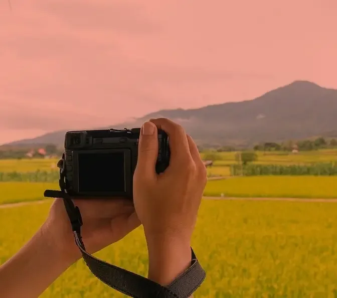
#PhotoCamera, #LandscapePhotography, #PhotographyExpert, #NatureShots, #ScenicViews, #OutdoorPhotography, #CameraGear, #LandscapeExpert, #TravelPhotography, #WideAngleShots, #PhotographySkills, #NaturalBeauty, #CameraTips, #PhotographyMastery, #LandscapeLovers
AI GeneratedMay contain errors
Video Summary
AI GeneratedThe speaker shares personal photography mistakes and lessons learned to help others improve their craft. He emphasizes that technical rules should be guidelines rather than restrictions and explains how to add depth, intentionality, and proper framing to images to move beyond simply capturing a \"beautiful scene.\"
I went to an observation deck to get a panoramic view of the city.
It was right before the sun was beginning to set,
so all the buildings were being basked by the increasing orange glow.
And these were some decent shots, but the magic of blue hour hadn't quite begun yet.
So as I was waiting around, I noticed a large crowd of people
gathered in front of one very specific section of the observation deck.
Being the FOMO photographer that I am,
maybe I'm missing a great shot or something.
Turns out, everyone was just photographing the sun setting.
It was a very beautiful scene,
the kind of sunset that makes you feel alive and have a general appreciation for life.
Like realizing how small our worries are
when painted against a canvas that has been burning beautifully for billions of years.
I know, very profound.
And so naturally, I had to take the photo like everyone else
to encapsulate these precious feelings.
Like, yeah, this is going to be a great shot.
Until I got home and looked at the same majestic photo that I took and...
What the focus is this?
This isn't the sunset that I witnessed.
This photo doesn't bring me peace and calm.
Instead of feeling profound like I did in that moment,
I was left feeling dumbfounded at this moment.
Maybe my parents were right and I was wrong.
Maybe I should have been a lawyer or a doctor.
Certainly not a bloody photographer.
But it made me realize something.
Just because a moment is beautiful doesn't mean it will always make for a great photo.
And over the years, I've learned that a great photo,
in my humble, vogue opinion, needs visual layers.
And we can simply create that with the three S's.
Subject, scale, or story.
Subject, really easy.
You just need something or someone to anchor the scene.
Combine that beautiful sunset with another person enjoying that moment
and it will instantly create that same feeling of life appreciation.
Scale.
The subject here is the Eiffel Tower with the beautiful sunset.
And the wide shot is nice, but by taking a photo of what's under its feet,
the hustle and bustle of Paris.
Creating that feeling of big sun, small worries.
And finally, story.
On that same sunset blunder of a day,
I took this photo on the other side of the observatory.
And I just love it so much.
On the left half of the window, we see a budding young couple having a romantic moment.
And on the right half, a growing family.
Both sides sharing the same window and sharing a similar moment.
A beautiful sunset with their loved ones.
And the story I feel here is the progression of love.
Someday, the couple on the left here might be back with a child of their own.
And the funniest thing is, the sun isn't even part of this photo.
It's just a picture of ordinary people in an ordinary space
that just so happened around the same time.
But the actions expressed by the subject were far more profound than a beautiful sunset.
I may not have a medical degree, but you can still call me Dr. Jason Vaughn.
So let us continue to diagnose four other grand mistakes all photographers,
including myself, regret making.
Regret two.
Happy accidents.
Now, it's often said if you want to do street photography,
you need a 35 millimeter lens.
If you want to shoot portraits, you need an 85.
If you want to shoot architecture, you need a 12.
While there are some merit city suggestions,
it's often so repeated on the internet that most people believe
are the defining rules of photography.
And doing otherwise means it's wrong.
If you're using an 85 millimeter for street,
then it's no longer considered street because it's too tight.
If you're using a 12 millimeter for portrait,
then you're distorting the person's face.
And if you're using a 35 millimeter for architecture,
then you're not capturing all the beauty it has to offer.
You might as well be a failure.
And I believe that for years.
As newcomers, we get so easily influenced by the hearsay on the internet.
And I would buy these lenses specifically to use them
for those ultra specific scenarios and nothing else.
Oh, I'm doing portraits.
Better bring the 85.
Thankfully, I've smartened up a bit over the years,
but there was still one rule that I couldn't shake off until recently,
which was the idea of shooting portraits
with an ultra wide angle fisheye lens.
What are we doing?
Shooting skateboard videos or something?
My brain just couldn't comprehend it.
Fisheye lenses tend to have an uncanny distorting effect.
But one day,
whilst I was testing out the TT Artisan 7.5 millimeter fisheye lens,
Vivian asked me to take a photo of her.
But I was like, this is a fisheye though.
She was like, I don't care.
Just take it.
And so I did.
And oh my God, to our surprise,
the results look freaking sick.
You have no idea.
We became obsessed with this combination here,
so much so that we did a pro shoot with it.
It just feels so different from all the portraits
that we've taken up to this point.
It felt more fun.
We feel like it really brings out the personality of the subject.
We're not doing your standard, rigid, typical professional poses.
No, baby, we're shooting for vibes.
I mean, yeah, it's still a little crazy distorted on the edges,
but photography is all about creativity, not strict rules.
Having some rules and guidelines is fine for learning.
But once you know them, don't be afraid to distort them
because you might end up with some happy accidents.
Regret three.
Keep them separated.
A lot of photographers had and may still have this condition,
but don't worry, it's curable.
And this is a mistake that took me years to finally see.
But when we're doing photography, we're not just capturing the subject.
We're also capturing what's behind the subject, aka the background.
A lot of people don't realize this,
but the background is equally important as the subject themselves,
even if it's going to be blurry.
As an uncertified doctor, I call this disease background blindness.
Accidental pole sticking out of the subject's head.
Other people walking behind your subject.
But the one I'm guilty of the most is the subject blending into the background.
Here's a portrait that I shot of Vivian.
Looks great, face well lit, loving the framing and the leading lines.
But unfortunately, the black top she was wearing blended in with the background.
I mean, she might as well be a floating head just ahead.
What would have rectified this was if I had photographed her
leaning up against the beige pillars.
But that wouldn't quite have the same effect.
Or if she had worn a different color top.
That's definitely not an option.
But we are not a colorful couple.
Our entire wardrobe mainly consists of dark colors.
So what we try to do more often nowadays is to take our photos with a lighter background.
Here's Vivian again in a different black outfit,
but see how much more she's standing out now.
And obviously, this tip goes beyond portraits,
product photography, animal photography, tip photography.
What?
Yeah, only the real ones know what I mean.
So the next time you're photographing, pay extra attention to the background.
And like the offspring always sings.
Keep them separated.
Regret for a patient's patience.
By now, you know, lighting is important.
But today, I'm not going to tell you to buy a flash
or an external lighting equipment to light your subject.
I already did that a few videos back.
Check it out when you have time.
Rather, I want to train your mental capabilities
to seek out scenes with natural lighting and shadow patterns.
Because these two combinations here,
I don't think it's shared enough on the internet,
but would really elevate your photography.
So let's pretend the light over there is the sun
and the two wooden blocks are buildings.
And this Mario kart here is our moving subject of interest.
If we take the photo while Mario is still in the shadows,
there's no separation.
He's literally blended into the background.
Not really a good shot.
But if we patiently wait for the subject to move into the light
and then take our photo.
Bada bing, bada boom.
Look how much better it is.
Timing the subject with the lighting
not only creates an anchor point in your photo,
but also it will make it a hell of a lot easier to edit in post
to create the look that you want.
And the darker shadows there kind of creates a frame within frame
to guide the viewer's eye to the subject of interest.
So in real life, we might find the perfect background
with the perfect lighting,
but most people don't wait for the perfect subject
to enter the perfect position.
Remember, a great photograph, in my humble opinion,
needs visual layers.
Here we have one, a beautiful colorful mural as our background.
Two, with the high noon sun beaming down between two overpasses.
And three, our lovely subject rolling in.
Beautiful.
See the difference between the crowd of people in the shadows
versus the one subject in the light?
I used to make the mistake of not putting the subject in the light
and always had a tough time rescuing the subject from the shadows.
But by shifting my approach to finding the background,
the light and the shadow first,
and then letting the subject walk into the light,
it has made everything so much easier.
Now I know there's going to be a Michael in the comments going,
Okay, fine.
Here's me in Yosemite, California doing a Mazda car photo shoot.
Look at the difference between taking the photo of the car in the light
versus the one in the shadows.
You happy now, Michael?
Quit your excuses and do some photography.
God, these armchair no-profile photo critiquers.
Boy, nothing sucks more than taking some incredible photos
just for them to be displayed incorrectly on social media.
Our cameras, by default, shoot at a 3x2 aspect ratio,
which is fine because we're getting maximum resolution out of our sensor.
But depending on where we'll be uploading our photos to,
we may need to be more intentional with our framing.
Take, for example, while we can't upload in almost any aspect ratio on Instagram now,
and it will be displayed correctly on the home feed,
4x5 will still be displayed the best,
not only to take advantage of the phone screen real estate,
but also on both the discovery and your pages feed.
If we stick with the 3x2 default aspect ratio on our cameras
and frame our composition too tightly,
then we would lose the edges of our frame when we upload to Instagram.
Can't tell you how many times that has happened to me.
Lots of times.
And Instagram algorithm is doing this dumb thing
where a single image isn't going to do well anymore.
Like, you can't just upload one photo.
You need to upload a carousel, an album of photos,
in order for the post to be served organically to current and new followers.
Amen.
Don't hate the player, hate the game.
Or some guy named Adam.
So we need to make sure all the photos that we're uploading are in the same aspect ratio.
We can't mix them.
We can't start with a 4x5 and have the next photo be a 16x9.
They all have to be the same size within the same post.
And for the sake of the example,
we'll just stick to focusing on 4x5.
Now, some cameras will have a 4x5 guideline
you can enable on the screen to help you frame.
But just in case you don't,
here's a couple of things you can do.
One, just shoot a little wider
and you can always readjust the framing later in post.
Two, add a white background to your photos
to preserve your original intended aspect ratio.
This is by far the most perfect solution
if you want to mix a bunch of different aspect ratios.
And finally, three, I personally love to crop my photos down
to the cinematic 21x9 aspect ratio.
So in a 4x5 frame,
I would often stack three of those together in one frame
to abide by the 4x5 aspect ratio.
God, how many times have I said the phrase aspect ratio in this section?
Eight times.
Oh, yikes.
I know it's super dumb and loads of work,
but knowing where your photos will end up
and how your photos will show up
will save you a lot of headache and heartache.
Your portfolio presentation matters,
and that's the doctor's order.
And remember this,
you can't go wrong with Jason Vong.
Squarespace is an all-in-one platform to create beautiful websites.
No coding knowledge needed.
It's perfect if you want to showcase your photos,
sell prints, and run your business online all in one place.
And with Blueprint,
Squarespace's new AI-powered website builder,
getting started has never been easier.
Just answer a few quick questions,
and it instantly builds a custom site
with layouts, colors, and even sample content.
Plus, built-in SEO tools to help more people discover your site.
Use my link down below for a 14-day free trial,
and when you're ready to launch,
use code JASONVONG to get 10% off
your first purchase of a website or a domain.
Thank you guys so much for watching.
We'll see you guys in the next video.
Peace.
Oh, someone call the ambulance.
But not for me.
Jason Vong is not a real doctor.