
DIY AGED VESSELS || THRIFT FLIP || FAUX ANTIQUE EFFECT
5 Video Views·Oct 29, 2022
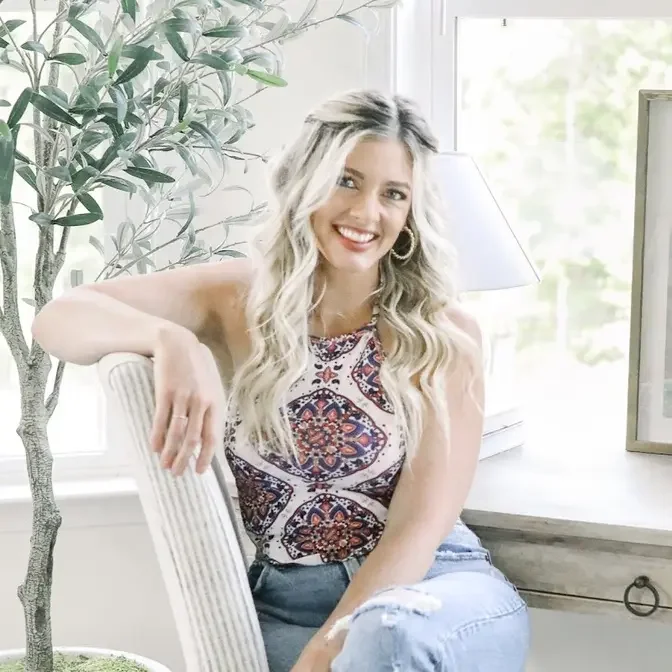
Hey everyone, it's Jenna. Welcome back to my channel where I show you how to get the high-end
designer look on a budget. In today's video, I'm going to be showing you some aged vessel DIYs.
Now, if you guys follow my channel regularly, you guys know that I'm a big fan of incorporating
worn, aged, vintage pieces into your space. I feel like this really just adds another level
of coziness. It kind of gives your room layers when you layer the old and the new. It gives it
depth, makes it feel very lived in, and it's just a design technique that I really love to use.
A lot of my favorite designers all incorporate worn, vintage pieces into their spaces as well,
and one of the most common things that I always see them using are old urns, old vessels, old
vases. It just really gives your decor a little bit of something extra, makes it feel like it has
a story, has character, and most of these vessels and vases that these designers use are anywhere
from $200 to $600. I personally do not have the budget for something like that, so I'm going to
show you guys how we can recreate this look today with some cheap DIYs, and you truly will not be
able to tell the difference between the authentic aged ones and the cheap DIYs. So today, we're going
to be DIYing four different vases, and I really wanted these vases to just have a very earthy,
taupe-y, rustic kind of color palette, so I did use the same colors throughout my vases. I just
varied the technique, what I actually did to the vase. So just keep in mind that if this color
scheme doesn't really work or fit into your home, that you can totally do this with more gray tones,
more whites if you want them lighter, or if you want them darker. I think the technique here is
really what gives it that look, so I'm excited to share that with you guys. So if you guys are ready,
as my grandma would say, let's go give it a whirl. Okay, so this first DIY is actually a cookie jar,
and I got this thing for five bucks at the Habitat for Humanity restore, and I saw this piece, and I
immediately was drawn to its shape, and I tested it to see if it would look cute without the top
on there, and sure enough, I was like, this would be a really pretty vase. I think that's really
important when you go to the thrift stores to really imagine the piece not as it is, but with
a fresh coat of paint and you know some pretty aged detail in there. I think that when you kind
of look past what an item is, that's how you're really able to find the cheap stuff that nobody
wants and transform it into a masterpiece. So enough chit-chat, let's show you guys how I
transformed this little cookie jar. Okay, so first thing I did was give this guy a nice coat of matte
black spray paint. I wanted the other products to stick to it since we were working with ceramics,
so I figured this would be a good base, and I also prefer to use matte spray paint because it doesn't
have a sheen, and that really helps achieve the aged effect we are going for. So next, I took this
Dixie Belle mud, and I feel like this stuff is absolute magic when it comes to creating that
aged effect. The directions say to not wash this down the sink, so I did use a paper towel to spread
it on my vase just so I could throw it away when I was done with it. So here, I just started spreading
the mud onto my vase, keeping in mind that it's kind of like a joint compound or a wood filler
in the sense that it will dry and adhere to the base, but some can always be lightly sanded off
if need be. And I first started spreading it in a horizontal pattern, but then I experimented with
dabbing it, and I really liked that effect much better, and I decided to continue doing that to
give the base a more random and abstract texture. To me, this kind of looked more natural and like
it was something created by time and nature rather than a paintbrush or a paper towel,
but I did kind of like the layered effect with the horizontal base underneath and then the
dabbed texture on top. I think that gave it a little bit of extra visual interest.
So next, I really wanted to accentuate these pretty ridge details, so I scraped a little
bit of the mud off just to highlight them by letting some of that black show through.
And once the mud had dried, I just wanted to go in and add a little layer of dimension,
so I took a Waverly chalk paint in the shade Truffle, and I just stabbed some on in little
random spots with a damp paper towel just to make it feel like it had layers of dirt with
dark and light in there. I really tried to concentrate the darker shade along the bottom
of the base because this gives it the appearance that has been sitting, aging out in the dirt or
clay for years, so I really tried to recreate that and make it look as natural as possible.
And once the chalk paint dried, I sealed it with this matte clear sealer just to protect it,
and I will say even though it was matte, it did kind of give a little bit of a sheen to it,
just so you guys know. You could always skip this step if it wasn't going to be in a high
touch area or, you know, you weren't worried about the mud kind of like flaking off or anything like
that. But overall, I still really love how this thing came out, and it's crazy to think that this
$5 cookie jar now looks like an authentic aged vessel that's been sitting out in the clay for
years. All right, so this next piece is actually one of the little jugs from a Studio Migi
collection at Target, and it was only $20, which is actually a very good price for a little jug.
I feel like you can find vases and pots and stuff for cheap, but jugs are usually a very
interesting shape and tend to be a little bit pricier, so the fact that I got this thing for
$20 was actually really great. I think it is still available. I will link it below if it is,
but I know it's from like a couple lines ago, so I really loved it at the time when I bought it in
the store, and then I got home in my space, and I just did not love the color. It was a little bit
too peachy almost, had some pink undertones, was just very orange. It did not go with my color
scheme at all, so instead of returning it, I was like, you know what? This was a great price for
something like this. Let me see what I can do with a DIY. You really just have to look for those
things that give a piece some character and make it special, and in this case, I really loved the
shape of the jug, and then I love the little handle detail on there. I thought that was so cute,
so unique, and just gave it a little bit of something extra, so I'm really excited to kind
of play with this shape and show you guys how this one came out. Okay, so first I just wanted
to give this jug some added texture, so I picked up some joint compound from the Home Depot for
like six bucks, and what I love about this stuff is that it goes on all pretty in pink and then
dries white, so you know when it's dry, and here I just smeared on a really thin layer of the joint
compound and then patted it with my gloves for some added texture. I will say that these gloves
are key for creating this effect. Okay, so once our jug was all white and dry, I decided to use
some paints to add a bit more earthy tone to it. I created a base layer with a Waverly chalk paint
in the shade Mineral. To make all of these vases, I actually only used a variation of three chalk
paint colors, and I'll have all of those listed below that I used for each base. I just feel like
all of these colors have a really pretty natural undertone that mimic nature and are able to give
these vases a dirty effect without actually being dirty, which is kind of cool. So once the jug was
all coated in this light grayish color, I then took a damp paper towel and would dab bits of the
shades Truffle and Fawn, and I really like the chalk paints because they don't have a sheen to
them, which helps create that matte, dirty, aged effect, and I also really like using a wet paper
towel because number one, it's cheap and easy to clean up, and number two, a bit of the paper towel
actually rubs off onto the piece, giving it a little extra layer of texture, which is really nice.
And as you guys can see here, if I dab too strongly and it looks a little bit too harsh,
I just go in with some more water, and that instantly softens it and makes it look much
more natural. So the damper the paper towel, the better, in my opinion. The only thing you
really want to keep in mind here is that joint compound is water soluble, so you don't want to
drench it, but for the most part, it all stays intact, and if not, I just go over it again with
a little bit of chalk paint, and you can't even tell. So here, I'm just gradually working on
building up the colors, mixing both colors, and kind of highlighting some areas while making
others a more concentrated spot of the darker Truffle shade. The paint really seeps into the
texture we created with the joint compound, and I love the look of that. So once I was happy with
the look of the paint, I just gave this guy a coat of the matte sealer because I wanted to seal in
all of that joint compound. But there you have it, you guys. I love that I was able to tone down
the orangey, peachy tone of this jug and just give it more texture and a little bit more earthiness,
so now it is able to fit in my decor perfectly. So this next piece, I was so excited to find.
It was only six dollars at my local thrift store, and I have been looking for a piece with a shape
like this for so long. It really reminds me of those like black aged pots that are on Mickey
& Co, or you can get them at Round Top or whatever, and they're black, and they just have that aged
effect, and they're so expensive. They're like 200 bucks, and I figured this was a perfect piece
to kind of recreate something that looks like that, but you know, I only paid six bucks for
the base, so I'm excited to show you guys how we did this one. Okay, so I also started out by
giving this guy a coat of matte black spray paint, and we will be covering up most of the spray paint
on this piece, but I like to have an extra layer of grit for our paint to really stick to, and this
Rust-Oleum acts as a great primer. So next, I mixed some baking soda in with our fawn shade of chalk
paint, and the baking soda just gives the paint a bit more dimension and texture. I will say this
piece probably has the least amount of texture out of all of the four vases, but it is probably my
favorite, which kind of surprised me. So once the paint had dried, I just used that same wet paper
towel plotting technique that we had used on our previous base, and I just kind of had fun.
I used a mixture of the same three paint colors and just kind of dabbed the three of them on a
paper plate, and then blended them out on the vase. There's not really a science to this, you guys, so
have fun with it. If you use too much dark paint, go back in and dab some light paint on.
This technique is super forgiving, and I honestly think the more layers of paint you have and the
more you blend, the better. So there were a couple of spots where the initial layer of chalk paint
had rubbed off, so I just went back in with some chalk paint on a paintbrush and blended it all
back in. So there you have it, a basic thrift store vase transformed into a gorgeous faux H
vessel. And like I said, this one was probably my favorite out of the four projects, and we'll be
taking center stage on our coffee table. So this next project, I found this guy at Lowe's, and it
was only $30. It was in their outdoor planter section, and I know $30 sounds like a lot, but
this thing is huge, and I thought it would be perfect for the base of one of my faux olive
trees to put that in. So I figured if I redid it and made it look very aged and old, it would
kind of like give my olive tree an even more rustic effect. The only thing that was like a
little meh about it was that it had the South Carolina logo on it, and I do think that that's
really cute. So I don't know if they sell these in different states with different like states
logos on them. I personally will put that part just towards the back just because it kind of
doesn't really go with my space or anything. I'm really, really happy with the end result of this
one. So yeah, let's cue the project and show you guys how I did it. Okay, so first I started by
dumping a big glob of the Waverly Chalk Paint in the shade Fawn on a paper plate and then mixed
in a bunch of baking soda for that added texture. I then went and gave the whole planter a nice
thick coat of the chalk paint and baking soda mixture. If you guys can't already tell, I'm super
obsessed with this fawn color. It's a little bit mossy, a little bit beigey, and a little bit
olivey. Just I love all of the earthy undertones it has. So one of my favorite details on this
planter were these raised ridges. So I really wanted to make sure I highlighted them and I just
went in with our darker truffle shade of chalk paint and made sure that I got into all of the
nooks and crannies around the ridges. This will give us a nice contrast and create the illusion
that dirt has gotten stuck in the cracks over time. I just gave the ridges a nice heavy coat
of the truffle and then I went in and dabbed it with a wet paper towel to just blend it out and
make sure that the darker shade kind of naturally faded out. And just like we did on the last base,
I went in with a damp paper towel and blended out the darker truffle shade, the lighter mineral
shade, and the medium fawn shade onto the rest of the planter just to kind of give it some dimension.
And once that had all dried, I just went in with our magic dixie mud and kind of patted it on the
planter in random spots to make it look a bit muddier. Keep in mind that this stuff will show
up a bit lighter when it is dry so I tried to make it pretty patchy so we had lots of dimension
with the other layers of colors showing through there as well. Okay so there we have it, a light
whitewash planter transformed into an aged rustic pot perfect for housing an olive tree. I can't wait
to show you guys what the whole thing looks like all put together in my workout room reveal which
will be out in the coming weeks. All right you guys so that concludes this video. I feel like I
really surprised myself with how easy some of these were and how actually like authentic they
looked. And you know I got to tailor it to a look that I wanted so I really hope that this video
inspired you. I know that I personally will be doing a lot more of these kinds of videos now
kind of like a little DIY fire under me so hopefully you guys enjoyed. Thank you guys so
much for watching and always being such kind supporters of me. It really does mean a lot so
thank you guys again so much for watching and I will see you all in my next video. Bye!