
How to a Paint Lifelike Portrait in Oils
Apr 11, 2026
Welcome back to the studio. We're just putting the final strokes on this
portrait of Kimmy and in this video I'm going to share with you my top three
tips for painting portraits in oils. It comes down to using great reference
material, drawing it out by hand, and making it pop. We'll talk all about that
in this video. But for the first part of this painting demonstration, I was
actually working on this piece in a live stream for my Academy. The painting
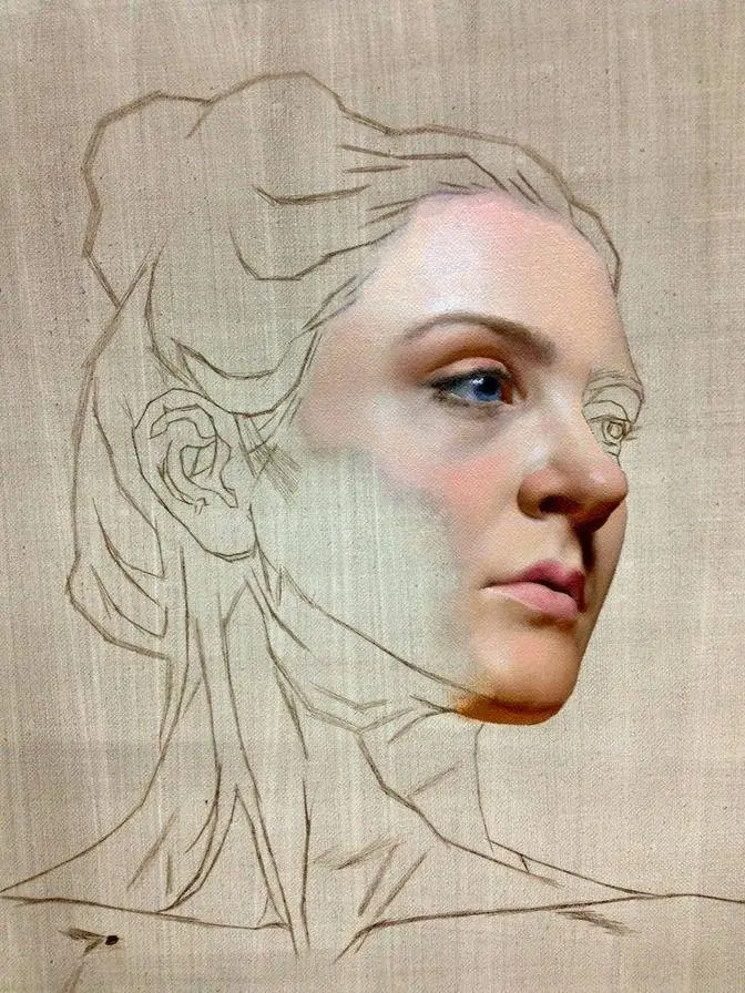
is 16 by 20 and I start off with a synthetic brush loaded with burnt umber
and a bit of quinacridone magenta and I begin to line in where the face is
going to go. What you're looking at here is the voluminous method and on my
Academy I've got several videos on how I construct a face using this very method.
So during the live stream I was painting for a couple of hours and we managed to
get pretty far with our portrait. Now using that luminous method really helps
me establish where all of the features are going to go. The correct placement of
the eyes, the nose, the mouth, but also getting those three key things that
really make a portrait. The elevation, the tilt, and the turn of the head. Now if you
want to see some videos on the topic of head construction I'd be happy to make
some of those for YouTube. I do have a bit of that material on my Academy as well.
Link is in the description. Okay for my first tip you've got to use
great reference material. Now ideally we'll get an opportunity to work from a
live model. That's always first prize right? Working from direct observation.
It's my favorite way of going. But sometimes our models just aren't
available. It can be a little bit expensive if you're hiring a model and
if you're just starting out it can be kind of intimidating. Although I am a big
fan of throwing yourself into a pressure situation to expand your skills rapidly.
Still working from photographic reference is a great way of going but
you've got to have good reference. I shoot all of my own reference material.
Now here these photographs of Kimi were taken outside but I also shoot
reference in a studio as well. Now I'm using a mixture of Canon DSLR and Sony
mirrorless and a range of lenses. My favorite lens for shooting portrait
reference is a Sigma 18 to 50 millimeter on a Sony a6400 just in case you were
wondering. I get back from my subjects and zoom in and that way I reduce the
amount of distortion that you could sometimes see in the face if you're
working from selfie pics for instance. Typically I go for Rembrandt lighting
because it helps create that classic look in your portrait painting but I
also love edge or accent lighting or rim lighting. This can help add a pop of
color, boost the contrast and add to the drama in the image. If you're looking for
some great portrait photographs to work from when you next paint the portrait
look no further. Click that link in the description. I've got hundreds of images
on Tisch Academy that are copyright and royalty free and that's where you'll
find this image of Kimi. Check it out. Oh by the way the pheasant that you see
just poking up on the bottom edge of the image. Yeah I was thinking at some point
I might have Kimi holding this pheasant in a future painting. Never really worked
out but the images of the face sure turned out great. I continually shift up
my approach when it comes to painting a portrait and I've been playing more and
more with chunkier looser brushwork in those first initial stages and then
while the paint's still wet working over the top with some very soft brushes. I'm
using a Rosemary and Co. series 275 which is a very short very soft
fiber brush and this really helps smooth out some of those brush marks. Oh and in
case you were wondering what was on my palette here's all of my colors here on
the screen. Hit pause and write these down. Maybe they'll help but I really
love using this palette for its range and versatility. I can mix it just about
anything with this series of colors and they all come from Blue Ridge oil paints.
You'll find all of my materials listed in the description below.
So previously we were talking about putting yourself in a bit of a pressure
situation to force your learning and growth as an artist. So for my second tip
it is draw it out. What do I mean by that? Well when we first start a portrait painting
there's so many different ways of beginning but I'm a huge fan of drawing
out your portrait by hand using a brush. Not projecting your photograph, not
gridding up an image, but actually drawing it out by hand. Sometimes a
method like the Loomis method can help. I also really enjoy treating the portrait
like a bit of an abstract object and thinking about the shapes that the
shadows make and those highlights and then mapping this out using the brush.
Thinking about it in a slightly different way, a little bit outside of
the box, but regardless drawing it out by hand and doing your best to make those
little adjustments and gauge one mass, one shape against another and working on
your lines and angles. This will help drive those skills further, faster. It's
when we rely on a crutch like tracing or gridding that it can hold us back as
artists. Now you might not get it right on every single portrait. I mean don't
get me wrong, this isn't an exact precise likeness to
Kimmy, but for me it's close enough. But the one thing I do have with this
portrait is the satisfaction that I drew it myself by hand. Now I'm not trying to
shame anybody for their individual unique artistic practice. If gridding and
tracing is your thing, carry on. As long as you've got a brush in your hand,
you're okay by me. But if this is something that you're doing, I would just
really encourage you to have a go trying it by hand every once in a while.
Forcing yourself to develop those skills. You'll be so much more
Since I first started trying this technique of drawing things out by hand,
normally with a synthetic pointed round, a little bit of medium and that burnt
umber, quinacridone magenta combination or permanent crimson combination. But I've
found since doing this, my confidence has soared and it's actually had this
cumulative effect where my skills are getting better and better. Now I'm sure a
few professional artists out there might agree with me that forcing
yourself into that sort of pressure situation will help you develop skills
more rapidly and you're never too far along to learn. That's the thing that I
love about art that keeps me hooked and addicted to this thing is that there's
always something new to learn. There's always another run on that ladder.
When I work on my portrait paintings, I'm thinking about general things first
before zeroing in on any detail that you see me painting here. Starting with those
big broad shapes. Thinking about the linear aspect of the painting. If I've
got the drawing more or less in the right place, I can achieve that likeness.
I really just want to sort out where are my features going like the eyes, the nose
and the mouth before I start worrying about individual little creases, wrinkles
and highlights like here in the lips. Once I have those big general things in
place, that's the time to focus on the detail. Now one thing is really important
for our painting and this is my third and final tip I want to share with you
here in this video and that is to make it pop. We want our portraits to pop and
have some life to them and one thing that can help with this is the
background. Now here I'm working on what's called an imprimatura. This is a
colored stain that I've applied to my 16 by 20 linen panel. This color originally
was burnt sienna mixed with a burnt umber and it gives a really nice warm
undertone to the painting. Now Kimmy was photographed outside and as such she was
surrounded by some trees and greenery and that bright morning sun. These leaves
being illuminated were popping this bright green color. Initially I thought
this might make a really nice addition to the composition but it didn't last
long. I ended up opting for a much darker treatment of the background but
regardless when I'm looking at my background I think about what is the
subject or what is the thing that I really want to draw the eye. When we're
painting a portrait often it's going to be the face right and so I look at areas
of the face that I want to really highlight and have a bit of impact. These
are often areas that have a lot of blood flow so areas like the eyes the nose and
the mouth. Notice the rich red colors that are in that mouth and a couple of
around the eyes but particularly that transfer of light through the skin
causing the nasal bridge to glow red just along that line the boundary of
highlight to shadow. Now if I want to highlight these areas in my portrait
painting I think about the complementary opposite of these colors in the
background but I'm thinking just generally here. So what is the opposite
of red? Well if we look at our color wheel like you can see right here it's
green right? So I generally shift towards the green but whatever is happening in
my portrait I think about the opposite in the background. So if I want my
portrait to appear bright then I make my background dark. If I want my portrait to
appear saturated and a little bit more colorful or have a higher intensity or
chroma then I desaturate. I decrease the chroma in that background. I ended up
getting pretty chaotic with all kinds of weird and wacky brushes and of course
the palette knife to create some texture but again thinking about that contrast.
Rough texture contrasted with smooth and delicate. Of course I'm thinking about
that light versus dark. I want the face to appear quite bright particularly those
sunlit highlights in the face and so I darken everything in the background by
contrast. Now I'm not saying this is the only way to treat the portrait it's just
something that I really enjoy and I think works pretty good. So if
backgrounds was something that you were struggling with previously maybe try
this and see if it will make your portrait pop a little bit more.
Now I appreciate you hanging around till this point in the video so just for you
I've got a couple of bonus tips to share with you. One thing I'm trying to do
within my portrait paintings or any other painting for that matter is create a
sense of three dimensions on that two-dimensional surface. I'm thinking
about how to create an illusion of reality. The paint texture itself plays a
vital role in achieving this three-dimensionality. I try to keep those
highlights pretty thick and so I'm laying in that color with mainly bristle
brushes. Now occasionally I'll blend with these series 275s like what you're
seeing here. This works really nicely in some of those shadows but softer brushes
and synthetics are best suited for your thinner passages of paint and so I keep
those thin passages in the shadow areas. So I keep my highlights thick and my
shadows thin. Now thick lighter paint reflects more light back to the viewer
and will help those areas pop just a little bit more. Keeping our shadows thin
allows that tone to register slightly darker. This works just as well for
landscapes and still lifes too.
Okay, just for you, my last bonus tip. Think about your working window. One
thing I found working with Liquin over the years which is an alkyd resin and
has a working time, a workable window of about six hours depending on the
humidity and temperature of course. But as this starts to set up what's called a
tack, it's still workable. But depending on where it is in its setup means that
you can apply different techniques. I've really been enjoying applying just a
little bit of blending. For somebody with smooth flawless skin like Kimmy, a little
bit of blending works quite well to create these even gradients from our
highlights all the way into our shadows. So I'm waiting for the paint to go off
just a little bit before working it. What this allows me to do is maintain some of
that underlying brushwork but just smooth it a touch. Renato Mucilo and
myself talked about this very thing on my podcast The Creative Endeavor. If you
haven't listened to the podcast, check it out. I'll include a link to that in the
description down below. Renato, as you may know, is a world-class landscape
painter based in Canada. We talked all about his inspiration and painting process and
we also talked quite a bit about the business of art. If you're looking for
something to listen to while you paint, I highly recommend it. Now we've only spent
about 15 minutes together here in the studio, but we have so much more to talk
about. If you want to elevate your artwork and take your techniques even
further than you thought possible, check out the full version of this
demonstration which is available right now on Tisch Academy. Click that link in
the description down below and get yourself a free 7-day trial. You'll get
instant access to over 300 hours of painting video content. This includes
full courses and painting demonstrations, critique videos, behind-the-scenes, an art
business course, and plenty of extras. Not to mention an awesome, exclusive
community of thousands of dedicated artists who are inspired and engaged.
Check it out. Link is in the description down below and I'll see you there. Thanks for
watching.